Activities that explain and define the elements of art
Introduction:
The visual arts constitute a discipline, a branch of knowledge. An art education curriculum includes, then, every aspect of this discipline. Lessons that explain and demystify what is experienced when art is made or viewed help build confidence, curiosity, and the desire to expand one’s definition of what art is. I called these lessons “Special Work.” How to express an idea is a challenge for each artist. The artist’s observers have the joy and exhilaration of seeing the results. The immediate experience of a work of art at times gives rise to questions in the mind of the observer. In his book “Criticizing Art”, Terry Barrett defines two complementary ways of gathering information as being internal and external to the work of art. Internal information is gleaned when one actively looks at or experiences a work of art. The observer describes what is seen and felt so as to appreciate what is found in the work itself. The information can relate to its subject matter, medium, or to the way its idea is expressed (realistic, abstract, or non-objective). How an artist uses the elements of art and principles of design accounts for how varied and exciting art can be. External information is gathered from sources outside the work itself which are spoken, written, or recorded on film or video. If you are fortunate, you may even be able to speak with the artist. An artist’s biography is often a big clue to understanding the origin of the work produced (Monet, Calder, M.C. Escher). Quotes from artists also reveal their thinking and attitudes about their work and art in general.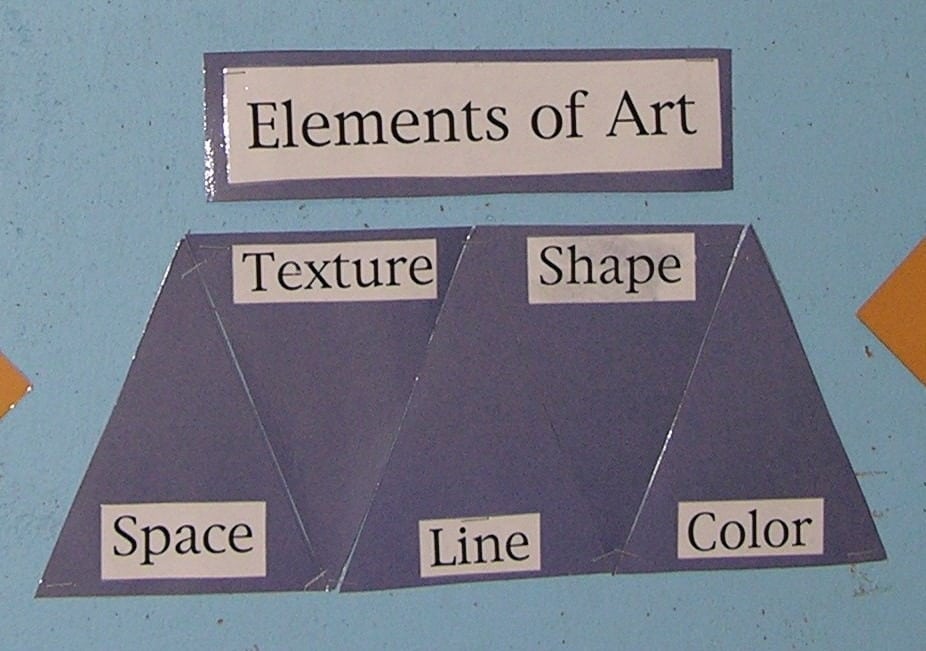
Introduction:
The Elements of Art are the most simple, most basic, and the most concrete part of a work of art. They are the building blocks of art. They are always present together. No matter what you do to isolate each of the elements, line, shape, color, texture and space come crashing together whenever an idea is visually expressed within the structure of an art form. Simple activities allow children to discover, investigate, or manipulate the characteristics of each element. Think of a simple drawing activity placed in the environment, such as white paper and a black marker. When a child uses them to draw an idea, all five elements are present. Lines and shapes will be easy to see. What about color? Because the work is done with black ink on white paper, it is described as having a monochromatic (single-color) scheme. Texture describes how something feels. In order to comprehend and see beyond the actual texture of the paper and ink, to all the possible kinds of textures that could be present in the work, the observer would need to know that there are four different kinds of texture. Space – all art uses up space. A drawing occupies two dimensional space; a sculpture occupies three dimensional space. Studying the characteristics of each element in isolation helps to see the dynamic interaction that occurs when they work together. You see more when you understand more, and you don’t bother to look for what is not there. Note: This section of the curriculum teaches about line, shape, space and color. The element of texture is covered in the section Sensorial Materials.
Introduction:
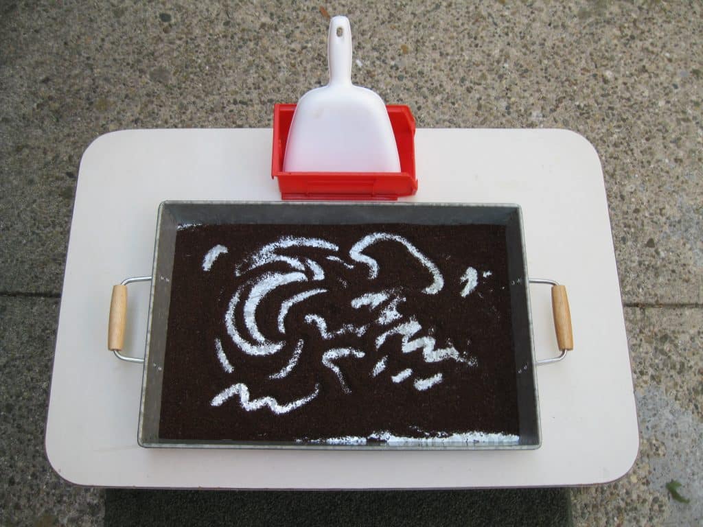
Line is the first element. Children start their artistic life by scribbling. There are many activities that are naturally done with lines (See: Art Forms). Simple drawing, the coffee tray, painting, work done with an overhead projector, and finger painting all rely heavily on line. Metal inset work is line before shape. We trace the bottom edge of the cylinder to help find the size of the matching negative shape in the cylinder block. All letter and number forms are made by a line or series of lines. Our mind is so clever that it can see lines that are only implied by a change of color, pattern, or texture. A line of dots with space in between them can easily be seen as a line (visual closure). There are coloring books that reduce famous paintings into a series of shapes using connecting lines.
Introduction:
I used the following two lessons as Special Work for children 5-9 (9-12 if needed). You will need a set of “arrow labels” for each of the lessons, especially if you want them in the environment at the same time. Children can practice making each kind of line with the coffee tray, then find them in one or more art reproductions. The labels can be made on heavy cover paper and hand laminated. It is a quick solution to making the labels, but they get bent easily. Professionally laminated labels are very strong. Using white paper mounted on mat board and then laminated takes a longer time to produce but is a longer lasting solution.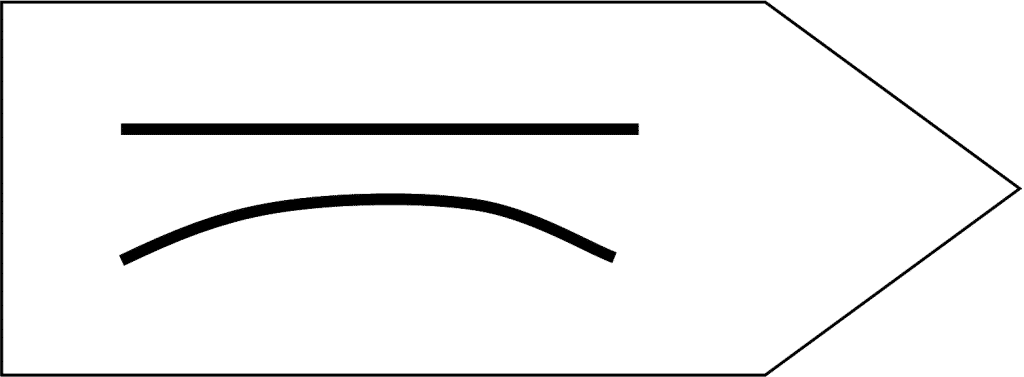
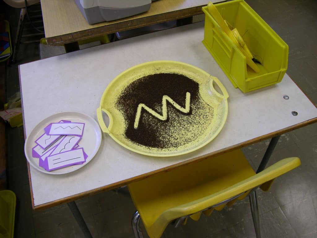
- Prerequisite: Unstructured use of the Coffee Tray for drawing and other activities that use line naturally
- Direct Aim: To practice making each kind of line to have awareness of each kind
- Indirect Aim: To use line creatively
- Point of interest: “The next time you finish a drawing or painting, you might want to figure out what kinds of lines you used.”
Materials:
- Cover paper or white paper on mat board (You choose.)
- Roll of laminating material
- A black marker
- Ruler
- A container for the labels
- The Coffee Tray activity
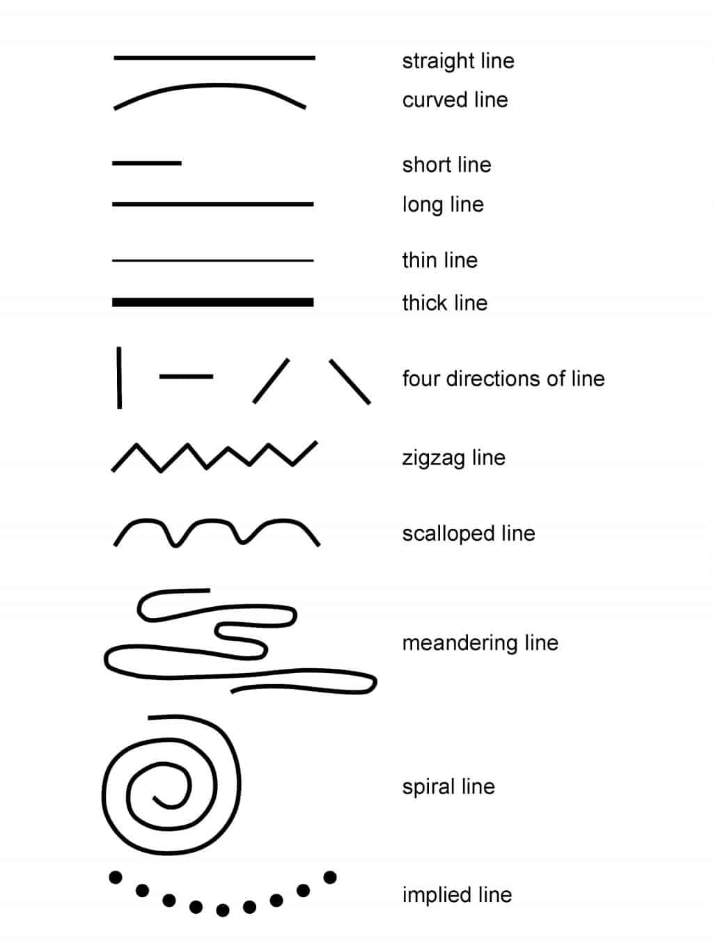
- The Characteristics Of Line chart printed from the image below
- A chair for an observer, to encourage peer teaching

Preparation:
- Print and laminate the set of line characteristics labels on this page
- Cut the laminated labels out, to be used as pointers
- Print and laminate a label for each type of line that has a name:
- Zigzag
- Scalloped
- Meandering: winding and turning
- Spiraling
- Implied (if using)
- Place the container with the labels above the coffee tray, to the left.
- Place an observer’s chair next to the Coffee Tray activity table.
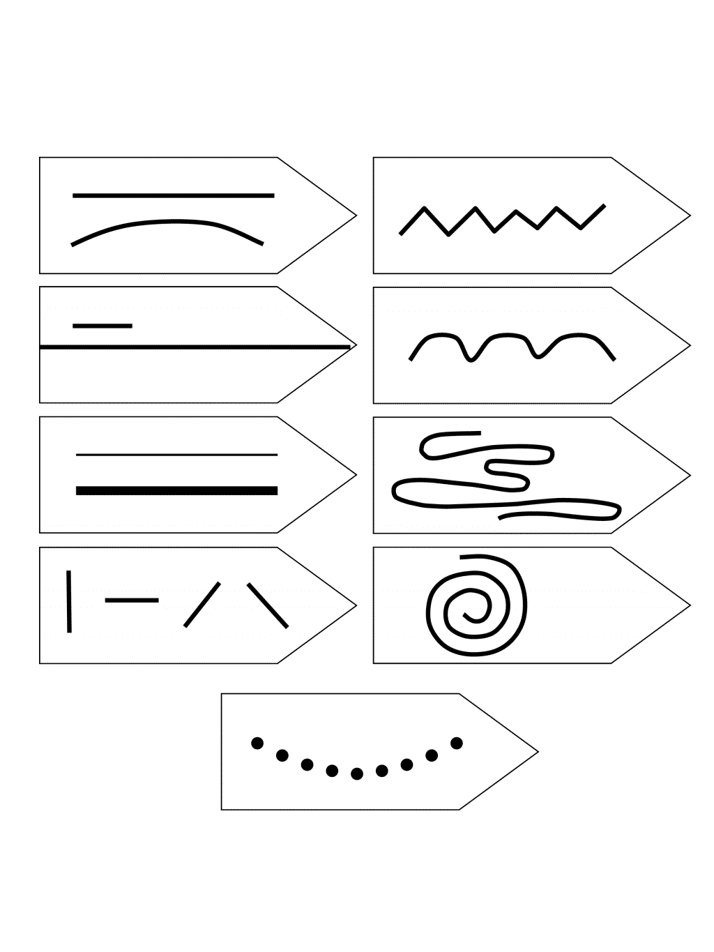
Presentation: individual lesson
- Choose a line label, announce its name, make the line in the coffee grounds, and set the label aside.
- Ask the child to erase the line. If help is needed, shake the tray with the child. Keep it on the table as you shake.
- Ask the child to choose a line they wish to make, or use the second period and ask them to find the ______line and make it.
- Continue until all the lines have been made.
- Return all the labels to the container and clean up any coffee grounds that escaped the tray. Check the floor.
Extensions:
- Suggest two children do the work together.
- Suggest a child offer the lesson to a learning partner
Introduction:
I used a poster size reproduction of the Matisse painting called The Rumanian Blouse with Green Sleeves, 1937. It depicts a woman holding a string of pearls in her hands (implied line and shape). The woman, her clothing, and the background contain examples of all the lines. Sadly, it is no longer available in print. There is an image of it at this Web site: https://www.tkinter.smig.net/Romania/ArtGallery/Matisse/RumanianBlouseWithGreenSleeves.htm Suggestions for reproductions follow this lesson.- Prerequisite: Making the characteristics of line in a coffee tray or another method of practicing the lines
- Direct Aim: To recognize characteristics of line in artwork
- Indirect Aim: To recognize the expressive qualities of line and use them creatively in their artwork
- Point of interest: “Do you think you might use the different characteristics of line the next time your draw an idea? Were there any lines you could not find?”
Materials:
- One or more reproductions of drawings that contain the characteristics of line
- A set of arrows of the characteristics of line
- 1 arrow for straight line, 1 arrow for curved line, 1 arrow for short line, 1 arrow for long line, etc.
- Tray and container for the activity
Preparation:
- Select the laminated reproductions of drawings.
- Make an arrow of each characteristic of line, or print the examples presented in the pdf file here. Laminate them.
- Assemble the work.
Presentation:
- Lay out the reproductions on a floor mat.
- Lay out the arrows on the mat.
- “Which kind of line shall we find first?”
- The work is finished when all are identified.
- It is possible not to find one.
- Reassemble the work and replace it in the environment.
Resources:
Amazon.com: Matisse Line Drawings and Prints: 50 Works (Dover Art Library) (Paperback). Choose the drawings you like. Copy, laminate, and mount them. Consider using pages 4, 15, 25, 35, 42. Download Characteristics of Line Arrow Labels, Single PDF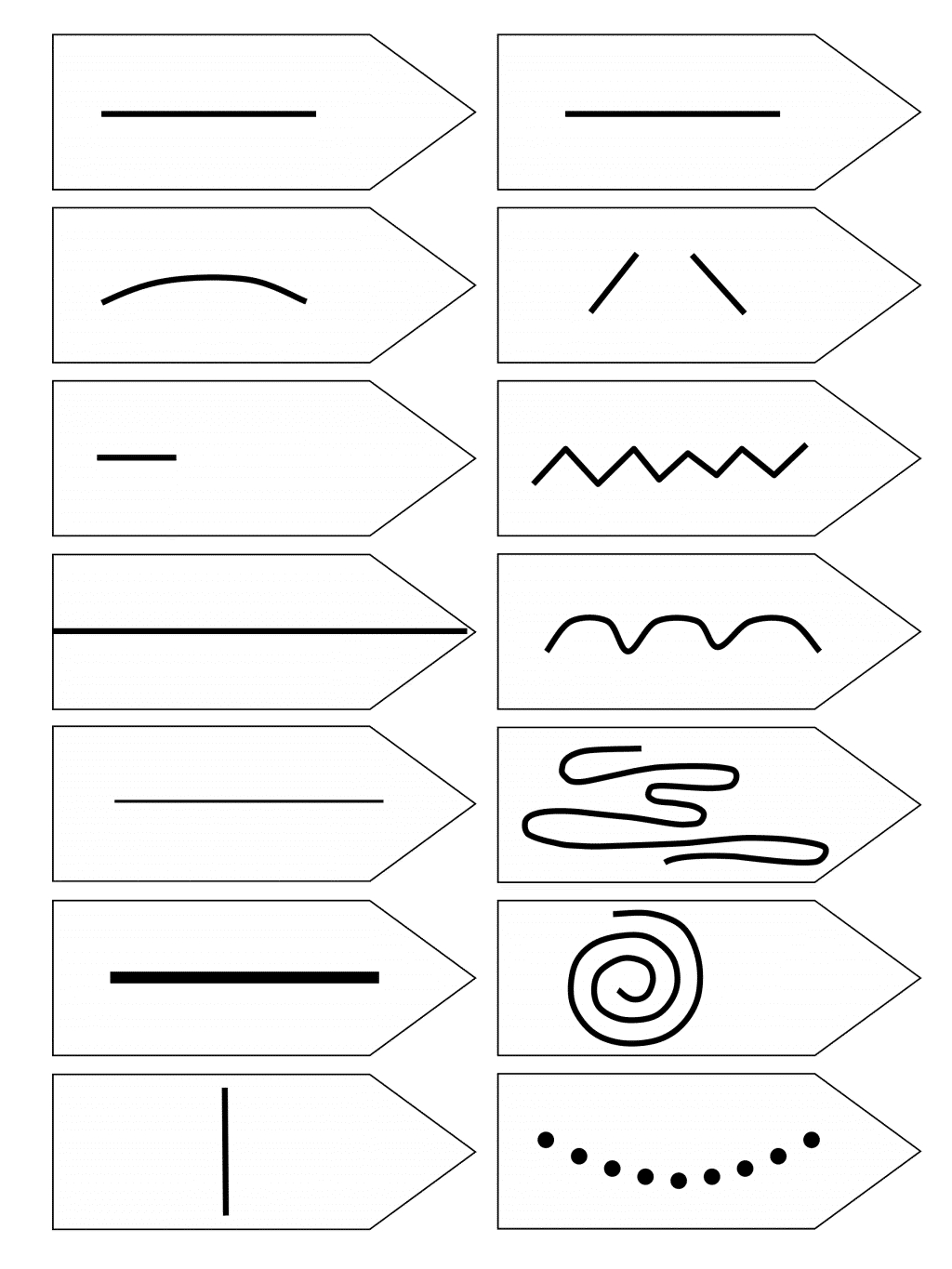
Introduction:
The suggested characteristics of line need to be demonstrated after the group has had lots of experience using lines in activities like those mentioned in the introduction. The last step in giving the demonstration lesson about the characteristics of line captures the importance of a line’s power to create a shape. It parallels demonstrating the 45 bead layout when the addition of “one,” whether it be a unit, ten or hundred, gives rise to a new quantity with a new numeral, a new significance, and power.- Prerequisite: Activities that use line naturally
- Direct Aim: To introduce the power of lines to make shapes
- Indirect Aim: To use line creatively
- Point of interest: Style emerges early. Children can identify scribble drawings. Ask your students to help you find the owners of unsigned work.
The Characteristics of Lines:
- Straight lines and curved lines
- Short lines and long lines
- Thin lines and thick lines
- Directions that lines take on paper: Vertical, Horizontal, Slanted (Oblique, Diagonal)
- Lines that have names
- Zigzag lines
- Scalloping lines
- A Spiral line
- A meandering line
- Implied line (optional)
- Lines that make shapes
- Implied shapes made by lines (optional)
Materials:
- A large sheet of white paper or poster board 18” x 24”
- A chisel edged black marker or a simple large pointed one
Preparation:
- Prepare a list of the characteristics of lines to be demonstrated for the presentation. Keep it with you when demonstrating if needed.
Presentation: 5-9 9-12 (If needed or for review)
Note: Organize the lines on the paper any way you wish. The lesson makes suggestions, but you may have more fun organizing the lines your way. Practice giving the lesson. You want each characteristic to be easily seen. After the demonstration is over, label the display and place it in the environment as a reference tool for the children.- Introduce the work by its name.
- “This work is about lines; all kinds of lines. You use lines everyday when you write words or numbers. When you draw or paint, you use them too. Not all lines are the same. I would like to show you how different they can be and what they can do.” If the children can spontaneously name them, then this is a review lesson which can be done quickly so as to get to the point. Lines can make shapes.
- “There are curved lines.” Draw a long gentle curve line. “And there are straight lines.” Draw a straight line under the curved one that is the same length. “The human body naturally makes curved lines. People invented rulers to help them make straight lines.”
- “Some lines are short and some are long.” Draw one short and one long straight line both the same width.
- “There are thin lines.” Draw a thin straight line halfway across the page. “And there are thick lines.” Draw a thick line across the other half of the page.
- “Lines can move in different directions. They can move straight up and down.” Draw four or five short vertical lines. “They can move straight across.” Draw four or five horizontal lines. “They can slant in one direction.” Draw four or five slanted lines in one direction. “They can slant in the opposite direction.” Draw slanted lines in the other direction. I drew right to left then left to right. Does it matter? No, it is a matter of preference. I am right handed.
- “Some special lines were created so long ago and were used so often that they were given names.”
- “This is a zigzag line.” Draw the line.
- “This is a scalloped line.” Draw the line near the zigzag.
- “A spiral line can be drawn in two ways. I’ll show you both ways and then you can choose which one you like the best. Try making it both ways.”
- Draw an ascending spiral as you describe it. “You start from a point and begin to draw a small circle that you keep making larger and larger until you run out of space or you wish to stop.”
- Draw a descending spiral as you describe it. “A spiral can be made with one big curved line that you keep making smaller and smaller until you run out of space.”
- “A meandering line wanders around the page and it can even double back.” Draw a meandering line.
- “I am going to make a bunch of dots, and your brain will be able to put them together so you see the line that is not there.” Make a smile with the dots. “It is called an implied line. Imply means to suggest. The line is suggested by the dots, and your brain picks up the information easily. It is called visual closure. I just implied that you all have smart working brains.”
- Turn the paper over for the next part of demonstration. “Watch what happens to the line as I draw.” Slowly draw a big circle. “When I connect the two ends, the line seems to disappear, because you can now see the newly formed shape, which is called a circle. The line creates the edge of the shape that separates it from the rest of the space of the paper. The space inside the line is called a shape. The circle seems more important than shape of the space that surrounds it. Both shapes are important. Both are needed to make the paper, which is a rectangle, more interesting to see. The circle shape seems to sit on top of the paper as though the paper is under it. Lines can create shapes directly, as shown in this lesson, or indirectly.”
- Note: If asked to make a shape indirectly, make an asterisk, or a circle of dots. Both read as implied circles.
- Display your demonstration lesson as a research tool for the children. Label the lines you’ve drawn, as in the diagram here, or just print the provided pdf file.
Second presentation: Optional
- Materials: Add the finished Characteristics of Lines poster to the materials used for the first presentation.
- Let’s look at the different lines, and create shapes. The circle was made with a curved line. What can be created using straight lines?
- What other lines can we use to make shapes?
Extensions:
- Make a matching game of the lines. Make sure there is an indication to the orientation of the line by establishing a larger space at the bottom for each card. Use two colors to make it easier.
- Make vocabulary cards of the lines.
- Use the characteristic of line when demonstrating finger painting, scratch board, or any other art form that uses lines. Casually mention their names as part of the presentation.
- The descriptive word “linear” can be introduced when discussing any artwork that emphasizes line or uses line like shapes, such as a Calder mobile, a Jackson Pollack painting, or an Alberto Giacometti sculpture.
Introduction:
Montessori Environments, designed for three to twelve year old people, contain a plethora of shapes. Some are three dimensional, and some are two dimensional. All curriculum areas are presented in concrete form as shapes. It is interesting that the word shape is rarely used. The three period lesson is so important when presenting new objects to children that a simple word like ”shape” would interfere with the educational directness of the lesson. It is when looking at art that the word shape is used, but it must be introduced. Shelf work is important in that it provides an opportunity to investigate the creative contributions made by shape. I taught that a shape can be two or three dimensional. The words “area” and “volume” denote the kind or amount of space present in a shape. Simpler, more easily understood words are needed to be used until the mathematical terms are properly introduced.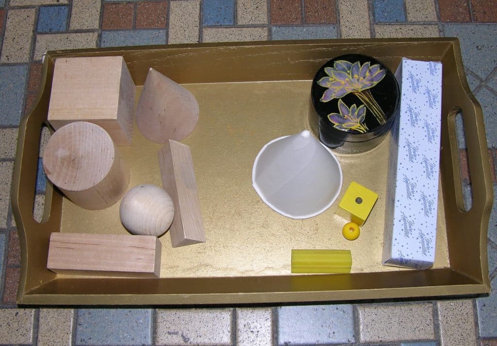
Introduction:
Start with a one to one matching activity. One geometric shape and one everyday object of that shape. Make it more interesting by adding more examples, but remember to make the number of everyday objects for each geometric solid the same.- Prerequisite: Study of the geometric solids
- Direct Aim: To heighten awareness of geometric shapes around them
- Indirect Aim: To see geometric shapes as having creative possibilities
- Point of interest: “Please share with others when you discover another object around you that is geometric.”
Materials:
- A set of geometric shapes, preferably smaller than the traditional ones
- One example of an everyday object for each chosen solid (no Food)
- A tray for the activity
Preparation:
- Chose 5 or more solids and matching objects.
- Cube - large bead
- Cylinder - box
- Cone - paper cone cup
- Triangular Prism - pencil holder (plastic guide for pencil grip)
- Rectangular Prism - small paper or cardboard box
- Ovoid - fancy wooden egg
- Square Based Rectangular Prism - cardboard box
- Square Based Pyramid - a decorative gem stone
- Sphere – large marble or small, interesting ball, sports ball
- Assemble the activity and decide where it belongs in the environment.
Presentation: 5-9
- Place the wooden solids down the mat in a line to the left, as in the photo here
- I suggest you start with the sphere
- Place the objects in a group to the right or leave them in the tray.
- Set the tray to the right.
- Ask a child to make the first match. Suggest they chose a shape they like and find the everyday object that is the same shape.
- Match all the shapes.
- Reassemble the activity and place back in the environment.
Extensions:
- Add a second or third everyday object for each solid.
- Make a Matching Two Dimensional Geometric Shapes and Everyday Objects activity. Suggestions: Small sheets of paper: square or rectangle, paper clips: ellipse, doily: circle, guitar pick: triangle etc.
- Use photographs of each group as a matching game.
Introduction:
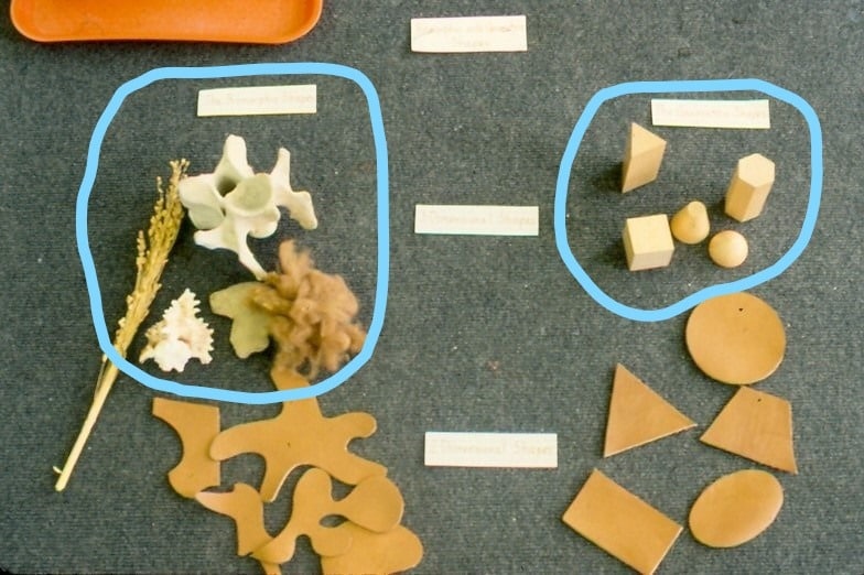
This is a sorting game. Make each group equal in number as a control of error. Find interesting objects for this work.- Prerequisite: Experience with the Sensorial Materials
- Direct Aim: To identify different kinds of shapes
- Indirect Aim: To use the shapes creatively to be able to identify both kinds of shapes in artworks
- Point of interest: Have you noticed things around you that you know could be used in this activity?
Materials:
- A smaller set of wooden geometric shapes
- Note: Include any unusual ones in the set that are not found in the traditional Montessori set.
- A collection of biomorphic (Natural) objects: a big bone (neck or ball joint: see a butcher for help), a shell, a sponge, a leaf, a dried plant such as a bunch of wheat, a small tree branch
- A set of labels: One large: Geometric and Biomorphic Shapes
Two smaller ones: Geometric Shapes, Biomorphic Shapes
- Laminating material
- Containers and tray for the activity
- A work mat large enough for all the materials
Preparation:
- Collect the geometric and natural examples.
- Make and laminate the labels. Make a second set to file.
- Make the work mat if used.
- Ready the work for the presentation. Decide where it belongs in the environment.
Presentation: 5-9
- Place the work on a floor mat.
- Lay out the title label on the mat. “This is a sorting game of geometric shapes and biomorphic shapes.”
- Choose the geometric shapes label and place it on the left.
- “The shapes called geometric solids have names you have been learning.”
- Choose a geometric shape and place it on the left. “This is a geometric shape.”
- Choose the biomorphic shapes label and place on the right.
- “The second group of shapes is called biomorphic shapes. Bio means living. Each shape is part of a plant or is part of an animal you have seen before.”
- Choose a Biomorphic shape and place it on the right. “This is a biomorphic shape.”
- Ask students to sort the rest of the shapes.
- Mix the shapes after the lesson is over.
Extensions:
- Make a sorting game using small reproductions of paintings, sculptures, photographs, or prints.
Introduction:
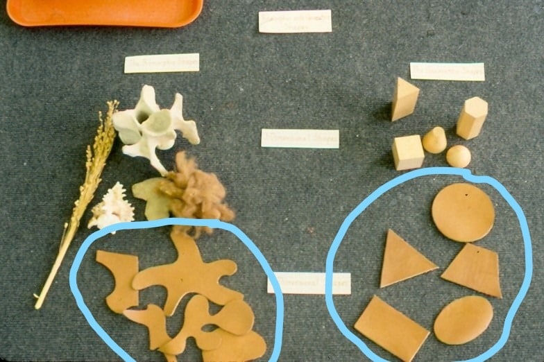
This activity parallels the above lesson and presents flat shapes that are found in paintings and drawings. The materials are different, but the idea of the work is the same. Note: The photograph of my activity presents both two and three dimensional shapes. It was in my elementary environments. For younger children, I separated them into two activities placed next to each other (3D then 2D)Materials:
- Leather for making the geometric and Biomorphic shapes
- A set of labels: One large: Geometric and Biomorphic Shapes, Two smaller ones: Geometric Shapes, Biomorphic Shapes
- Lamination material
- Containers and tray for the activity
Preparation:
- Make leather geometric and natural shapes about 3½” to 4” in size.
- Make and laminate the labels. Make a second set to file.
- Make all of the labels (for elementary).
- Three Dimensional Geometric Shapes
- Two Dimensional Geometric Shapes
- Three Dimensional Biomorphic Shapes
- Two Dimensional Biomorphic Shapes
- Ready the work for the presentation. Decide where it belongs in the environment.
- Make all of the labels (for elementary).
Presentation: 5-9
Follow the procedure used in the first presentation.
Georgie Story
Three small Montessori satellite public schools were brought together in the George Sands building located in downtown Cincinnati, Ohio. The plant manager gave me a large tin container of old keys his staff did not use. I had never seen such beautiful keys. They were varied in design, shape, and size. I selected 12-15 of the best to clean and polish. I put them in a container and placed them with the other collections of objects used with the overhead projector. The figure-and-ground lesson was developed after I observed a beautiful watercolor painting being done by a talented child. She colored the keys but left the background unpainted. I asked her if she would like to paint the rest of her design and she said no because it was only the space around the keys. I gave the first figure-and-ground lesson after that encounter. At the end of the lesson, a child asked if the ground shape was a negative shape. The child’s question had revealed to me the importance of having the figure-and-ground lesson follow the presentation of negative and positive shapes.Introduction:
This lesson is started by making a simple drawing of a shell using an overhead projector (See: Art Forms: Overhead Projector Drawing and Painting). I highly recommend that you add this equipment to your environment or have quick access to one. The lesson will need to be modified if it is not available. You will need to draw the shape yourself.
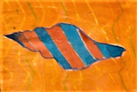
- Prerequisite: Negative and Positive Shapes with the Cylinder Block #2. Experience using an Overhead Projector for Drawing
- Direct Aim: To reveal figure and ground Shapes, or the positive and negative shapes, on a 2-dimensional plane
- Indirect Aim: To recognize, and creatively use, figure shapes and ground shapes when drawing, painting, etc.
- Point of Interest: “Do you think you could give this lesson to the classmate who was absent today?”
Materials:
- Drawing paper 8½” x 11”
- Pencils
- Thin Markers
- A shell
- Cover paper to make the lesson and labels
- Large Title Label: Figure-and-Ground Shapes
- Smaller Labels: Figure Shape, Ground Shape
- Laminating material
- Overhead projector if available (See Resources at end of this topic)
Preparation:
- Place an interesting shell on the overhead projector.
- Trace the outline of the shell on a piece of drawing paper.
- Trace the outline of the shell on 2 pieces of cover paper that are the same color.
- Cut the shell out of one piece of cover paper and discard (recycle) the paper around the shell. The shell is the figure shape (i.e. the positive shape or the foreground shape).
- Cut the shell out of the other piece of cover paper to make a hole where the shell was. The shape around the hole is the ground shape (i.e. the negative shape or the background shape).
- Laminate the figure shape and the ground shape.
- Make and laminate the labels.
- Figure-and-Ground Shapes
- The Figure Shape
- The Ground Shape
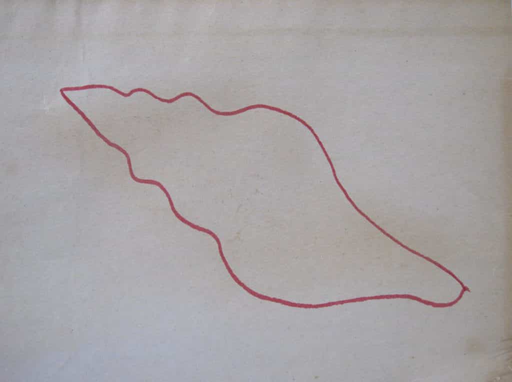
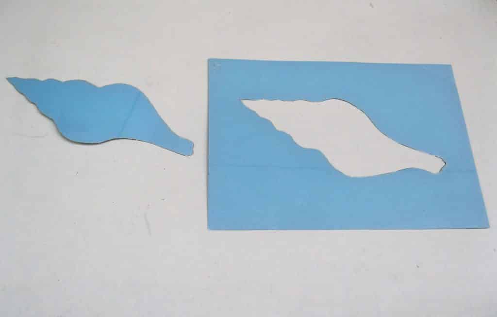
Presentation: 5 (6-12 where needed)
- Before you start the lesson, hide both of the laminated shapes under the presentation mat.
- “This is a lesson about Figure Shapes and Ground Shapes. Not all shapes are the same. They sometimes do different things in a work of art.”
- “Please look at the drawing I made with the overhead projector. What do you see? Let’s answer together. Good, you see a shell. That is exactly what you were meant to see. It stands out. It is the most important shape on the paper.”
- “Now, here is the trick question. How many shapes are there on the paper?” Run your finger around the outside of the paper to help them see the other shape. It is possible that no one will answer. If they do, “one” is the usual answer.
- At that point bring out the laminated shape of the shell and place it on the drawing where it belongs. “What is missing? Yes, the rest of the paper is missing. The rest of the paper is also a shape, and is part of the drawing.”
- Bring out the other laminated shape that has the hole in the shape of the shell. Place it on the drawing and remove the shell shape. Now we have two shapes that complete the drawing. Place both shapes to the side and continue the lesson using the drawing.
- “The shell shape stands out and looks more important. It is called the Figure Shape. It looks like it is in front of or on top of the rest of the paper. The shape that is the rest of the paper that surrounds the shell is called the Ground Shape. The ground shape appears to be behind and under the figure shape. We have to be taught to see these important shapes.”
- Place the labels in the drawing.
- Ask: “If this drawing was made into a puzzle, how many puzzle parts would there be?”
- Note: This lesson can be extended with an image from a collection of 25 reproductions available from Nasco Arts & Crafts 1.800.558.9595 https://www.enasco.com/product/9723580A
Extensions:
- Make a wooden puzzle of the shell drawing.
- Collect materials and illustrations from the environment that have a simple figure-and-ground relationship. Identify the shapes.
- The letters and words printed on the illustration are figure shapes. You could ask, “Is the word in this illustration a figure shape or ground shape? It must be one or the other.
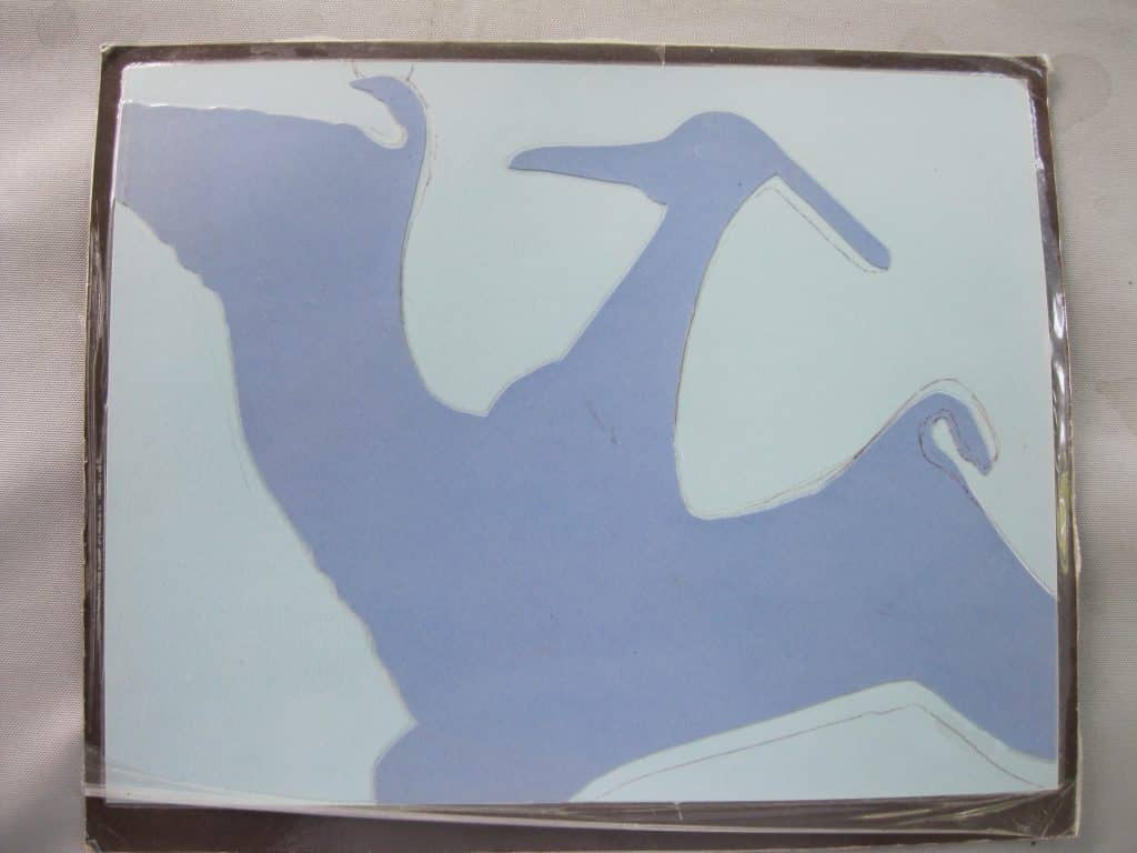
Introduction:
When drawing a wooden stool, it is normal to concentrate on its wooden parts which in a drawing are the figure shapes of the object. The ground shapes in the drawing are those that represent the spaces that appear in and around the object. In a work of art, all shapes are equal and all are a part of the success of the idea. The artist can use the shapes of the negative spaces to correct the drawing if needed. Each acts as a check for the other. Both the positive and negative shapes need to be drawn correctly if the drawing is to make the object appear three dimensional. The following activity continues the study of figure-and-ground relationships. The pterodactyl (dinosaur) activity has color to reinforce learning of the figure-and-ground shapes. The recording of the work reveals the learner’s understanding of figure-and-ground relationships.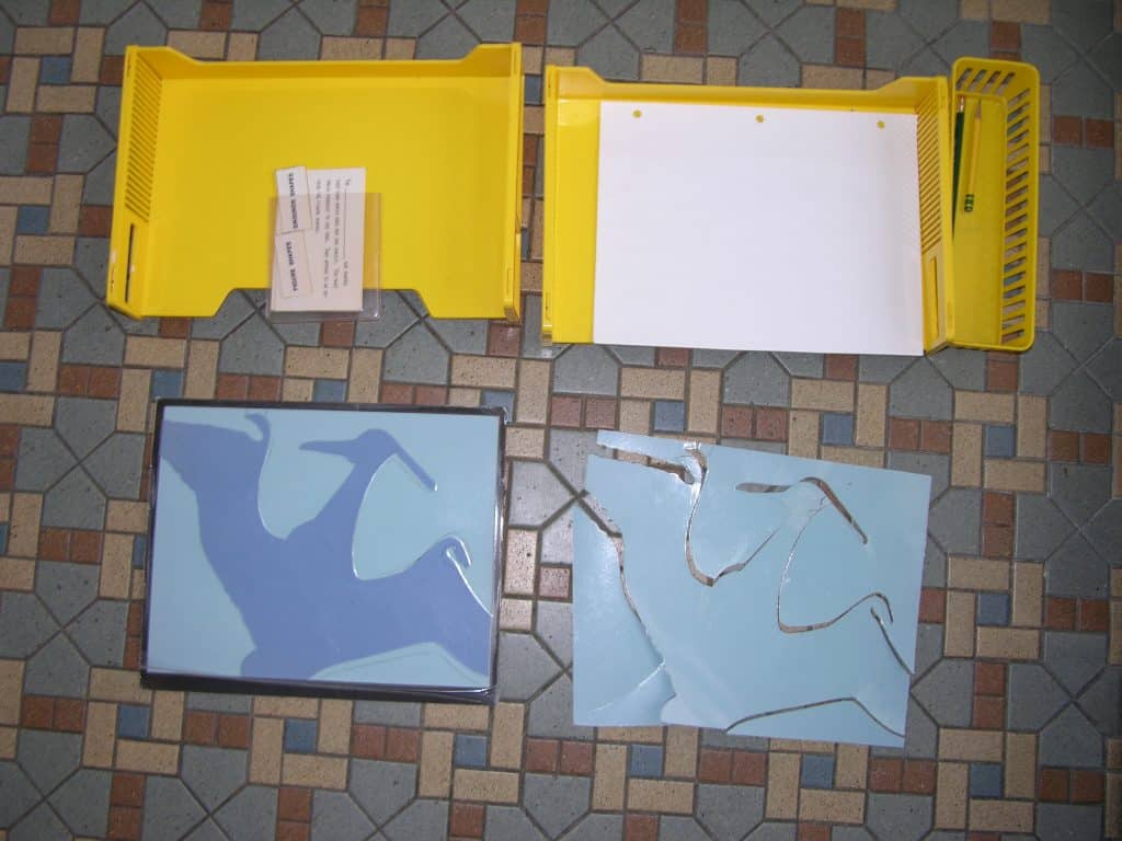
- Prerequisite: The Shell Figure-and-Ground Activity
- Direct Aim: To reveal figure-and-ground shapes in a more complicated design to allow the learner to design their own worksheet
- Indirect Aim: To recognize, and creatively use, figure shapes and ground shapes when drawing, painting, etc.
- Point of Interest: “Find figure-and-ground shapes or lines in your work.”
Materials:
- Two colors of 9” x 12” cover paper to make the design for the lesson
- One sheet of black cover paper 11” x 14”
- A printout of the pterodactyl shape on 11” x 17” (ledger size) paper
- Right-click on the pterodactyl image below
- Select “Save as…”
- Choose a file-storage location (folder) on your computer
- Select “Save”
- Print the image file 11” x 17”, or have a print service print it
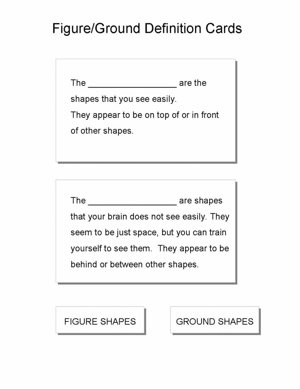
- Definition cards, printed on 8½ x 11 from the image below
- Roll of 3-mil self-adhesive laminating material at least 12” wide (Read instructions on box, and practice using on small pieces.)
- Plain 3-hole paper
- 2 desk paper trays with Pencils in a container
Preparation: 6-12
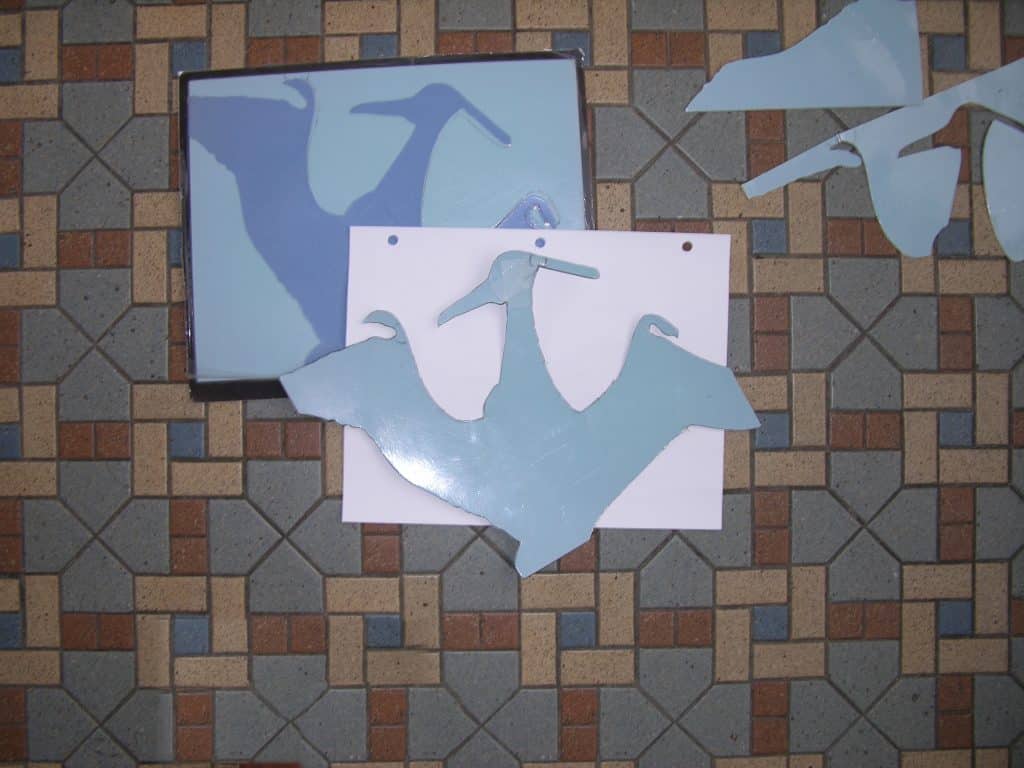
- To make the finished design for the Presentation:
- Trim the 11” x 17” pterodactyl printout to a smaller rectangle.
- Laminate the trimmed rectangle with one or two sheets on both sides.
- Carefully cut out the laminated pterodactyl shape.
- Place the whole shape of the laminated pterodactyl over a piece of the darker cover paper.
- The shape will overlap the cover paper in places.
- Copy the placement in my simple design if you wish.
- Trace around the parts of the pterodactyl that lie on the paper.
- Cut the resulting pterodactyl shape out of the cover paper.
- Glue or paste the cut pterodactyl shape onto the lighter cover paper in the same position it had on the darker cover paper.
- Mount the entire design on the black cover paper and laminate the mounted design front and back.
- To make the figure-and-ground puzzle parts for the activity:
- Place and trace around the whole pterodactyl on another 9” x 12” piece of the light cover paper, to match the finished design example.
- Laminate the traced line drawings.
- Cut the whole laminated figure-and-ground design into pieces. There will be 4 pieces if you used my design.
- Copy, cut out, and laminate the printed Figure/Ground Definition Cards.
- Assemble the work.
Presentation: 6-12
- Introduce the work by its name, “This is a pterodactyl dinosaur puzzle to teach figure-and-ground shapes.”
- Place the finished design example on your teaching mat. Place all the pieces of the dinosaur design mixed up on the mat.
- Pick up the picture and ask “What do you see right away?”
- “Right, you see the pterodactyl. It is the figure shape.”
- Pick up the pterodactyl puzzle shape and lay it on the whole picture.
- “Notice, the rest of the pieces are needed to complete the picture. They are the ground pieces. They appear to create a rectangle of paper upon which the pterodactyl shape rests.”
- “Would someone like to choose one of the pieces and place it on the design?”
- Ask students to continue placing ground pieces to finish the work.
- Name each piece of the design with the students. “This is a ground shape, this is a figure shape, this is a ground shape, etc.”
- Mix up the pieces on the mat again. “Put my puzzle together again. I will check it.”
- “The next time you do special work, place the whole pterodactyl shape I made on a piece of 3-hole paper. Move it around until you have created an interesting design.
- Trace around the parts of the pterodactyl that lie on the paper, then remove it.
- Identify each shape of your design by writing its name (gs or ground shape, fs or figure shape).”
 Note: The child’s design might place the pterodactyl shape such that, when traced, it no longer looks like a pterodactyl. At this point, the student gets to decide which shapes function as figure shapes and which shapes function as ground in their design. It is possible that simple shapes in the child’s design can be seen as functioning alternately as figure or ground. (See: Ocvirk, O., et al. (1998) Art Fundamentals, Theory and Practice. Page 27.)


Introduction:
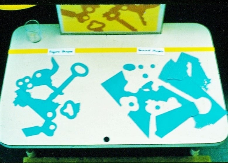
This activity has the most complicated design. My original activity was done with orange figure shapes and yellow ground shapes of cover paper. The identifying figure-and-ground puzzle shapes for the activity were done on light blue cover paper. It was later made into a wooden jigsaw puzzle, but was never finished and placed in the environment. Figure-and-ground relationships and overlapping shapes and lines are simple ways to create the feeling of “real” three dimensional space on a two dimensional plane. These three lessons begin the study of space (See: The Art Chart: Principles of Organization (Design): Space).- Prerequisite: Shell and Pterodactyl Figure-and-Ground Activities
- Direct Aim: To reveal figure-and-ground shapes in a complicated design to encourage doing the work more independently
- Indirect Aim: To recognize, and creatively use, figure shapes and ground shapes when drawing, painting, etc.
- Point of interest: Tell students, “The next time you draw or paint, see if you can find figure-and-ground shapes or lines in your artwork.”
Materials:
- 3 colors of cover paper (My original design was 10” x 13.”)
- 1 color for the figure shapes (orange)
- 1 for the ground shapes (yellow)
- 1 color for the sorting shapes (light blue)
- Overhead projector and pencil
- Keys or a collection of another object that interests you such as spoons or scissors, to use as figure shapes
- Glue stick
- Mounting paper for the finished design
- Laminating material and or a frame for the finished design
- Scissors and/or a swivel X-acto knife, retractable mat knife, art knife with snap-off blades, or OLFA Touch Knife (knife is for adult use only – keep blade covered and keep out of the reach of children)
- Tray for the separate design pieces
- A special container for any small figure or ground pieces
- Labels for the work,
- 1 “Figure Shapes”, 1 “Ground Shapes”
- 1 plastic box frame 11” x 14” (optional)
- A Title Label: Figure-and-Ground Shapes (optional)
Preparation:
- Using an overhead projector, make a design of keys or other objects. Move the objects around until you find a pleasing design of figure and ground shapes.
- Trace the design onto each of the three colors of cover paper.
- Cut out all the figure shapes from the darker color (orange). This is where the swivel X-acto, mat knife or OLFA Touch Knife will be helpful. You will not need any of the ground shapes.
- Using the glue stick, adhere the darker figure shapes onto the lighter colored ground paper following the penciled outline.
- Erase any pencil lines that remain.
- Laminate the finished design.
- Place the design in the 11” x 14” plastic box frame with wall mounts, double-sided tape, or loops of masking tape to hold it in place.
- Laminate – or double laminate – the third (light blue) tracing
- Cut all shapes apart to create the figure and ground shapes that are to be sorted and named. See the illustration of my original material.
- Make the labels for the activity.
- Assemble the activity.
Presentation:
- Introduce the work by its name, “This is a design [of keys] to give you the opportunity to identify figure-and-ground shapes.”
- Place the finished design example on your teaching mat. Place all the mixed-up pieces of the whole design on the mat next to it.
- “Would someone like to read one of the definition cards and place the correct word answer in the blank? Thank you.”
- “Please, place the cards on the mat under the picture. It does not matter which is on the left side or the right side.”
- “Notice, all the shapes are needed to complete the picture. They are either figure shapes or they are ground shapes. Together they create a design on a rectangle of paper. Each kind of shape is needed to create the idea.”
- “Take turns sorting the shapes. Have your work checked when you are finished.”
- Review the definitions with the group.
- “Mix up the shapes and return the work to the environment, please.
Extensions:
- Offer to your students the opportunity to develop their own figure-and- ground design using the overhead projector as a Special Work assignment. Ask them to label each shape “fs” or “gs.” After it is checked, they can erase the labels and continue to finish the idea into a work of art.
- Make the key puzzle out of wood
Introduction:
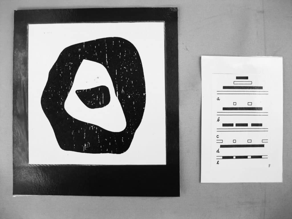
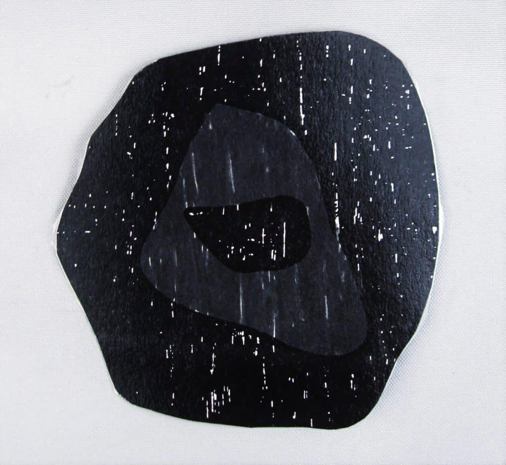
I first read Art and Visual Perception (Rudolf Arnheim) as a graduate student and often reread sections before designing learning materials. There was a fascinating and complicated analysis of a woodcut by Hans Arp (p.227). The figure-and-ground relationships can be seen in five different ways. Late in my teaching career, I finally got around to making it out of cover paper. It is an intriguing puzzle that develops visual thinking skills. I have made photographs and written directions here for making it into a learning device should you be interested in presenting this work. Make your own copy of the artwork and solutions on page 227 of the Arnheim book. Because of copyright laws, you cannot use the one I made.Materials:
- Black and white cover paper
- White 4” x 6” plain file cards
- Scissors, knives, and laminating material.
- Coding dots and black fine point permanent ink pen to identify each piece of each solution


Preparation:
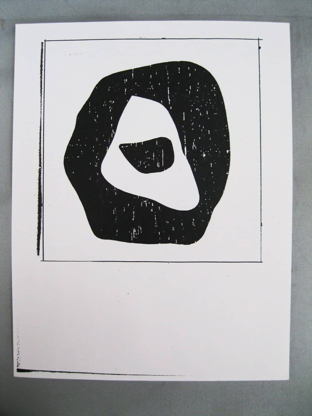
- Copy the design from page 227 in the Arnheim book, enlarge the design, then print it on white cover paper. Enclose it in a square. Make at least 6-8 copies. My square was 6½”.
- Make a copy of the whole design. Cut around the square, and mount it on black cover paper and laminate it. Make a copy of the diagram of the five possible ways to interpret the relationships. Mount it on a 4” x 6” file card and laminate it.
- Copy the diagram, cut apart the five possibilities. Mount each one on a white 4” X 6” file card.
- Do everything the easy way. Laminate a complete copy then cut out only what you need. Resist worrying about wasting materials.
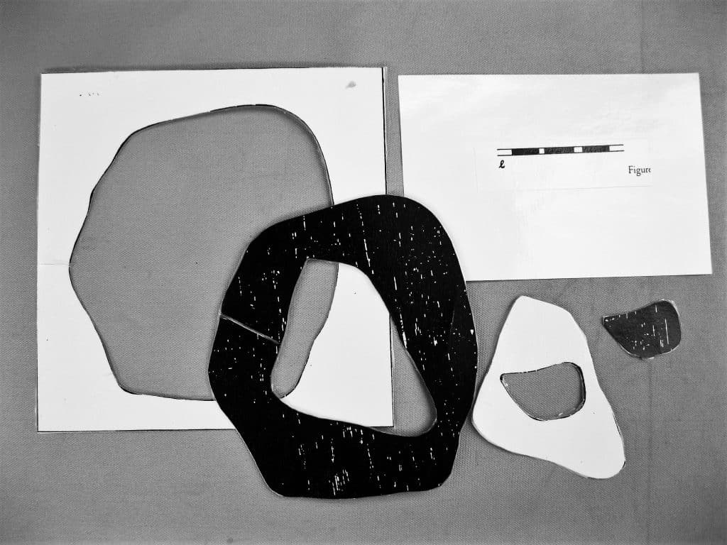
- Make example “e” first. You will have an example of each shape but laminate it first then cut it into pieces. If this is the first time you have ever used a knife, this may be a practice piece. Start by cutting the small black shape, then the white one, then the largest black shape. Version “e” consists of 4 pieces all fitting into each other. Put a coding dot on each piece of the solution with its letter.
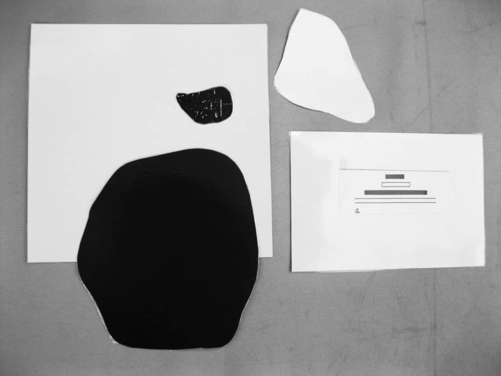
- Copy the whole design to make the “a” relationship. With a black marker fill in the white triangular shape. Cut out the large black shape with a scissor. With a second copy, cut out the small black shape with a knife. Keep it for the “b” relationship you will make next. Cut out the white shape. Cut a white square for the other 2 pieces to rest upon. Laminate separately the white square, the large black shape and the smaller white shape. Put a coding dot on each piece of the solution with its letter.\
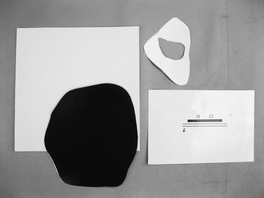
- Copy the whole design to make the ”b” relationship. Laminate the whole design. Cut out the small black shape then the white shape with a knife. Cut the large black shape with a scissors. If you cut the shape out with a knife the white pieces can be used for “c.” Laminate a white cover paper square for the 2 black shapes to rest upon. Put a coding dot on each piece of the solution with its letter.
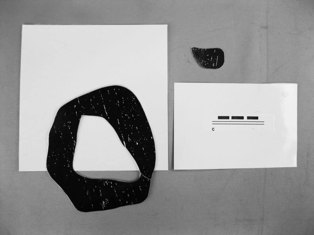
- Laminate a copy of the whole design for “c”. Cut out the large black shape, Cut out the white triangular shape. Use the small black shape you saved or cut it out of the white one. Make a white square and laminate it. Both black shapes on a white square make “c” the example. Put a coding dot on each piece of the solution with its letter.
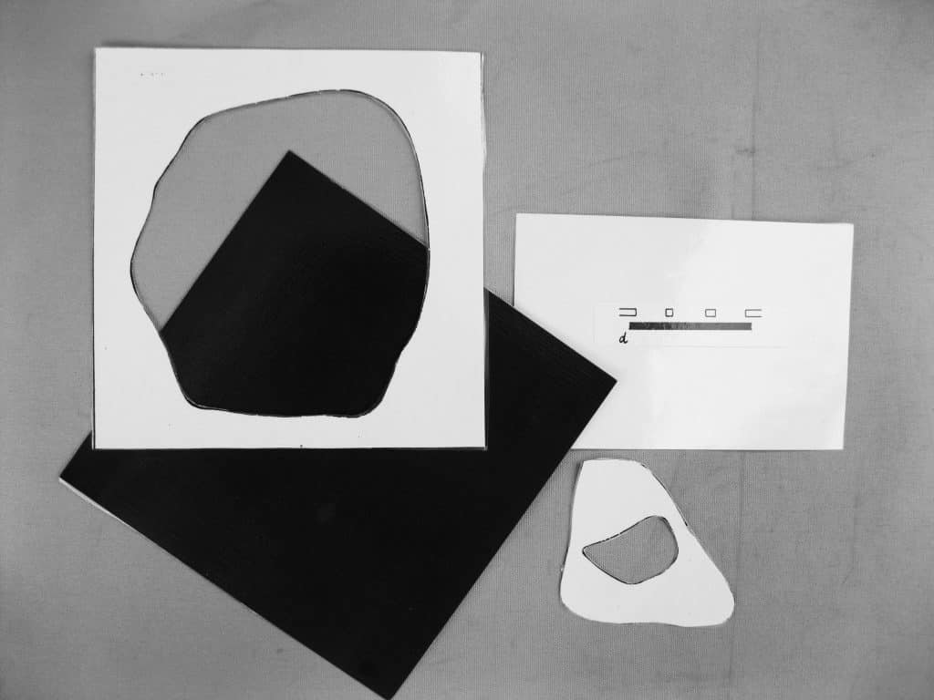
- Laminate a copy of the whole design for the “d” example. Make a black square that is the same size as the white one in the design and laminate it. Carefully cut out the large black shape with a knife. Cut out the white triangular shape and then cut out the small black one that is inside it. The white square with the big hole is placed on the black square. When the white shape is placed correctly on top of the black square the design is complete. Put a coding dot on each piece of the solution with its letter.
- Place each interpretation of the design on its own tray.
Presentation:
- Review pages 225 and 226.
- Arnheim, Rudolph. Art and Visual Perception, A Psychology of the Creative Eye. University of California Press, Berkeley and Los Angeles, 1974
- Introduce the woodcut by Hans Arp. Introduce the diagram that lists 5 different ways to interpret the figure-and-ground relationships of the work.
- Start by asking. “What shape seems to be closest to you?”
- “Right, the small black shape. It suggests the ‘a’ solution.”
- “Arnheim points out that “a” is a four-plane solution. Starting with the small black shape, each shape seems to be on top of each other. Let’s count the four planes: small black shape, triangular white shape, large black shape, and the white square.
- “There are four other ways to see the figure-and-ground relationships of the design. Study the diagrams and then see if you can construct each version from the pieces on its tray.”
- “After I check your work, mix up the pieces on each tray and put them away.”
Extension:
- Mix up all the pieces of the five solutions in one pile and let the students put them back together. After the work has been completed and checked, each individual solution must be checked and any misplaced pieces returned to their correct solution. This Extension parallels the final cylinder-blocks exercise that uses all four blocks.
- Make the activity into a series of wooden puzzles which would be larger, of course. Solution “e” could be introduced to pre-primary students. It would also serve as a presentation of the whole design.
- An elegantly framed reproduction would be a nice addition to the environment.
Resources:
- Buy a 3M simple overhead projector and an extra bulb. Investigate new and used projectors on line. Carefully read of the description of the used ones. Read any reviews that are available for each model.
- Knives are available at Home Depot, Target, Wal-Mart, Walgreens, Michaels, United Art & Education, Alibaba.com
- Coding dots: Office supply or discount stores
Introduction:
This lesson was given using the overhead projector. If this equipment is not available then the presenter can create an idea using overlapping metal inset shapes, as in the Presentation below. Prepare a simple idea no matter which way the lesson is to be presented. Overlapping is the simplest way to suggest three dimensional space on a two dimensional surface. It functions within any idea whether realistic or non-objective. It can suggest very limited space or a great deal. How much space is suggested depends on where the overlapping shape is located on the picture plane, what it represents, how big it is and what color it is. The next lesson called the Parts of a Picture Plane will complete the explanation.- Prerequisite: Drawing Activities, Overhead Projector activities
- Direct Aim: To explain the illusion of 3-dimensional space on a 2-dimensional plane
- Indirect Aim: To help demystify realistic drawing
- Point of interest: “The next time you draw, see if you can include overlapping shapes in your idea.”
Materials:
- An overhead projector (optional)
- 2 colored pencils, red and blue, in a container
- Sheets of drawing paper or manila paper:
- 5½” x 5½” if using metal insets
- 12” x 12” for projections or enlarged metal insets designs
- A collection of objects
- Draw the shapes freehand or consider using the metal insets as suggested in the lesson.
- 1 eraser
- Simple Watercolor Activity, markers, or oil pastels to add color
Preparation:
- Decide on the object(s) you will use to make the shapes or the shapes you will choose to draw. Either way they need to be similar in size and simple in shape. I used the ellipse from the metal insets.
- Pencils, erasers, and paper can be placed in containers near the metal insets with or without an overhead projector in the environment.
Presentation: 5-9
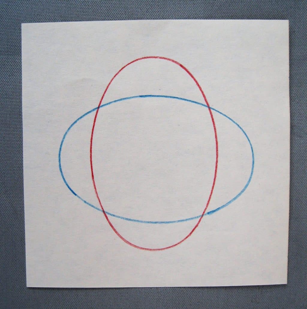
- “This is a drawing lesson. I am going to draw two shapes…” [start to draw an elliptical shape horizontally on the paper with the blue pencil] “…one on top of the other using two different colored pencils – one for each shape” Draw another similar shape crossing the first vertically with the red pencil. “They are crossing each other.”
- “You cannot tell which one is on the bottom or which one is on the top. If I want one to appear on top of the other I must change the drawing in some way.
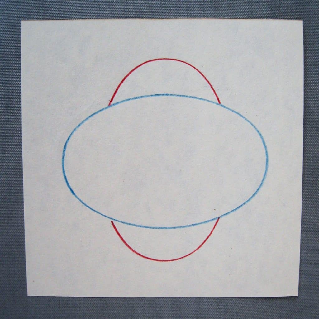
- “I am going to make the blue ellipse appear to be on top of the red one. To do that the whole blue line that makes the ellipse must be visible and the red lines that cross it need to be erased. Those red lines do not belong to the blue shape.”
- Erase the overlapping red lines and show the results. The blue ellipse now appears to be in front of the red one. (See photo here).
- “This is called overlapping. Is one shape really on top of the other?” Wait for the answer. ”No, it just looks like it is.”
- “Now that you know how overlapping works, I will make the drawing again without erasing.”
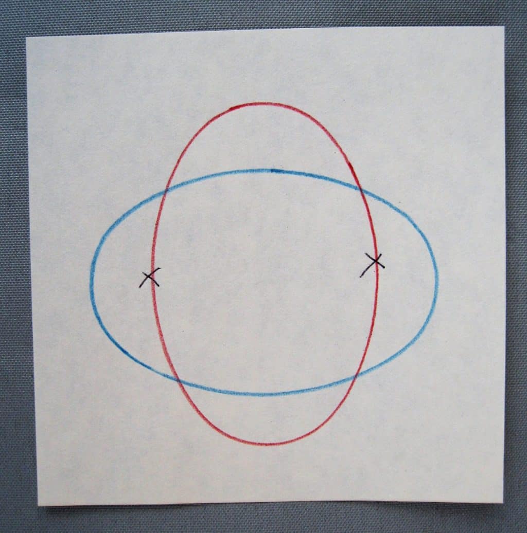
- Silently, trace the ellipse with the blue pencil horizontally across the paper. Place the ellipse vertically across the blue shape and pick up the red pencil. “I am going to draw the top of the red shape first. I need to start at the blue line and draw the ellipse up around the top of the shape, down the other side and stop when the pencil touches the blue line again.”
- Repeat the process for the bottom of the shape.
- The finished design looks like there is some space between the two shapes – not a lot of space, but it does not look flat.
- Review the figure-and-ground lessons. The blue ellipse is the figure shape and the red ellipse is the ground. And both seem to be on top of the paper.
 Note: This lesson can be given with the overhead projector and the elliptical metal shape, projected onto 12” x 12” paper.
Extensions:
- The Ndebele women of South Africa paint their homes with overlapping geometric designs using water-base paint. They make money by charging companies that publish or reproduce their work. They often repaint the house with a new design. Their homes are their canvases. Make a bulletin board of reproductions of their work and place an example on the Non-objective space on the Art Continuum (See: The Art Chart) after observing and discussing the work.
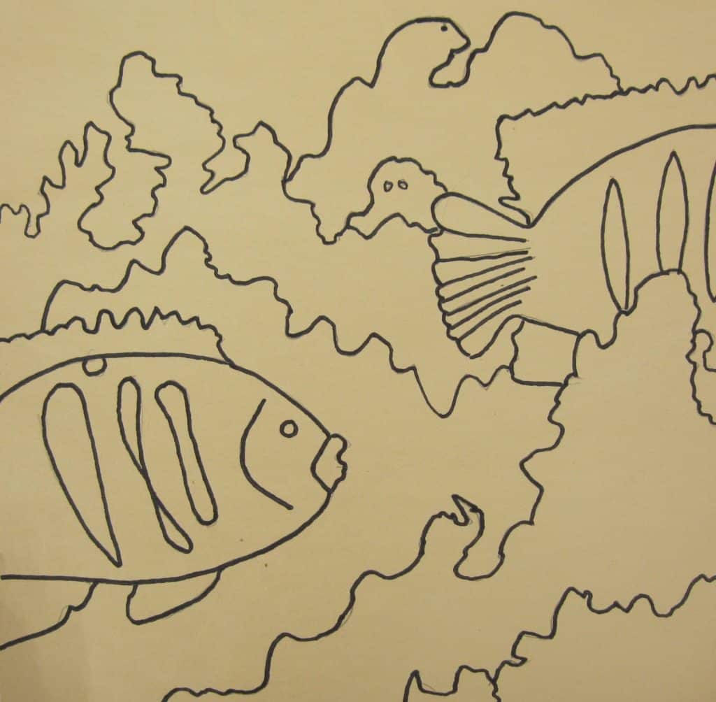
- With the overhead projector, you can use different objects to make your own examples of overlapping, as I did with the fish figures in the photo here. This example also illustrates a way to show objects coming and going across the picture plane.
Resources:
- Place library books about the Ndebele in your quiet space. This would be the best resource for copying images for your bulletin board. (Don’t sell reproductions without license from the source.)
- The internet has extensive sites that explain the culture and art of the Ndebele people. Browse on the term “Ndebele art” for images.
- For several good videos of Ndebele art, browse to: https://www.youtube.com/watch?v=ysphLzoLoGg&t=101s After you view them and make notes, I would turn down the sound when showing the video so you can narrate what is being shown and the children can ask questions.
- Nasco Arts & Crafts 1.800.558.9595 https://www.enasco.com/product/9723580 Product #9723580 is a collection of reproductions that are suggested to be used for several lessons. One reproduction is called Animals in Art. It is a collage of overlapping animals found in art. The laminated reproduction and a magnifying glass could be put out in the environment after introducing Overlapping.
- My first choice of artwork that creatively uses overlapping: The Aero, by Marsden Hartley. It is owned by the National Gallery of Art, but cannot be downloaded from that Web site. However, I was able to download a printable file of it from the following site:
Introduction:
When an art form is created on a two-dimensional surface the surface is called a picture plane. You can see the plane before you begin creating an idea on it. All art has five elements: line, shape, color, texture, and space. A picture plane provides the space. The idea is connected to the amount of space the plane has because space is one of the elements of the idea. It is possible to create a drawing that seems too small for the space of the picture plane it was drawn on. The extra space is not seen as connected to the drawing. All of what looks like empty space must be connected to the lines, shapes, colors, and texture of the idea. If the paper around a too-small drawing is cut down in size until it looks connected to the drawing, the idea will have a real picture plane. To create within the provided space of any picture plane is a skill learned over time. Sometimes learning it just requires awareness of its importance. There are numerous shapes that can be picture planes. Squares and rectangles are most common. Artists have also chosen to use circles and triangles. The first picture planes were natural surfaces like dirt and sand. Early people also drew on large stones; later they painted animals on cave walls. They painted on themselves, and on their clothing as well. After people could build houses, artists painted on the walls and the ceilings of them. Beautiful pieces of clay pottery were decorated with drawings or paintings. Artists have used pieces of flat stone, wood, cloth, paper, plastic, billboards and computer screens as picture planes. Book covers and note cards are picture planes, as are the sides of containers that hold food.- Prerequisite: Negative/Positive, Figure-and-Ground, Overlapping
- Direct Aim: To define what a picture plane is
- Indirect Aim: To establish the artistic importance of a picture plane
- Point of Interest: “That’s a nice drawing. Your idea fits the picture plane.”
Materials:
- 5-6 pieces of paper in the environment that can function as picture planes
- 5½” x 5½”, 8” x 11”, 9” x 9” 9” x 12”,
- 12” x 12”, 12” x 15”, 12” x 18”
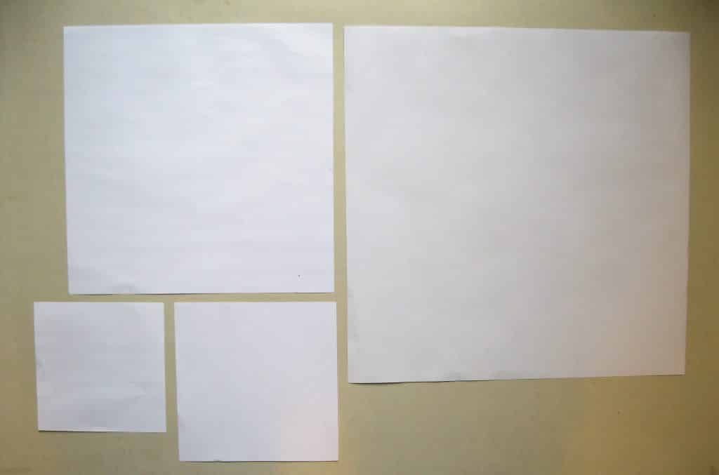

- Any examples mentioned in the introduction (optional)
- Pieces of flat stone, wood, cloth (canvas or linen), paper, plastic, computer screen
Preparation:
- Cut paper examples, as in the photos here
- Gather any other examples you wish to use in the lesson
Presentation:
- “These are the different sizes of paper that you could have, to make a work of art.”
- “These different sized papers are in different places around our room. This paper is used for metal insets. This one is used with simple watercolor painting. This one is for you to use with the overhead projector. This one is for you to use on the easel or on the floor. All of them provide you with just the right amount of space for your work. The space is flat like a table top. When a shape of paper is flat it is called a plane.”
- “When you use one of the pieces of paper for art, it gives you space to make a picture. Then the paper is called a picture plane.”
- “Not all picture planes are paper. Paintings are often made on cloth that is stretched over a frame.” Show any example you have. This is where you might wish to enumerate the variety of planes that have been used, as explained in the introduction.
- “It is most important that the idea you are making fits the picture plane. Every mark, line, shape, color on the plane is connected to it. They must look like they belong to that space. When everything is connected to the space then the space has meaning too.”
Resources:
- Fabric store: less expensive canvas (cotton duck) and linen
- Art Store: more expensive canvas (cotton duck) and linen
- Small pre-stretched canvases
- Hardware store, lumber yard, Michael’s: wooden planks
Introduction:
Figure shapes and ground shapes, negative and positive shapes, and overlapping shapes suggest three-dimensional space on a two-dimensional plane. Some ideas like landscapes and portraits can feel like there is lots of space represented in the idea. Most of the traditional ideas can have a foreground, middle ground and background. The space of the picture plane is not always divided evenly into a foreground, middle ground and background. Each part may vary in size but they all contribute to the success of the idea. In general, the foreground occupies the bottom area of the picture plane, the middle ground occupies the middle area of the plane and the background is usually near or at the top of the picture plane. It is possible for an object to appear so close to the observer that it extends from the bottom of the picture plane to the top and overlaps the middle ground and the background. (See: School of Athens, by Raphael)- Prerequisite: Negative/Positive, Figure-and-Ground, Overlapping, and The Picture Plane.
- Direct Aim: To be able to identity the foreground, background and middle ground, if present, in a work of art. To see that the foreground, middle ground and background are usually positioned from bottom of the plane to its top, or seem to be stacked on top of each other.
- Indirect Aim: To creatively use the information to make art or to appreciate what is being seen in a work of art
- Point of Interest: “The next time you see a painting, check and see how much space is suggested. Did the artist use overlapping? Is there a foreground, a middle ground, and a background visible in the painting? Have you seen an object in a picture as being a figure shape on a ground shape?” (Choose one or use all at sometime or another.)
Materials: 6-12
- 2 or more 11” x 14” reproductions of paintings that have a foreground, middle ground, background
- A piece of Bristol board for each 11” x 14” reproduction
- Laminating material
- A set of labels for the presentation in a container (print pdf file here)
- 1 dry erase marker
- 1 eraser for dry markers or a piece of soft cloth or a facial tissue
- Postcards or larger reproductions with labels in a container for shelf work
Preparation:
- Choose the reproductions. See: Resources for suggested images and how they can be used.
- The two reproductions I used when teaching children are no longer available in print, but are both available to download in a set of 25 at the Website of the National Gallery of Art (NGA). See Resources for details.
- Cut a piece of white Bristol board 11” x 14” and laminate it for each reproduction you plan to present in your lesson. It and the dry erase marker will be used in the presentation.
- Prepare each of the reproductions you use as follows:
- Copy and laminate the descriptive information that is on the back of each suggested reproduction.
- Trim the white edge from around each copy so all sides have an equal edge. Mount it on a piece of Bristol board 11” x 14” then laminate it.
- Print the labels provided on Bristol board and laminate them and cut them out. (See Extensions.)
- Gather all the lesson materials and place them on your teaching mat.
Presentation:
Note: For this lesson, I used a painting entitled Christina’s World by Andrew Wyeth, a photograph of The National Center for Atmospheric Research designed by I. M. Pei, and The School of Athens by Raphael. You may use additional reproductions from the same source for shelf work, or use postcards. You choose.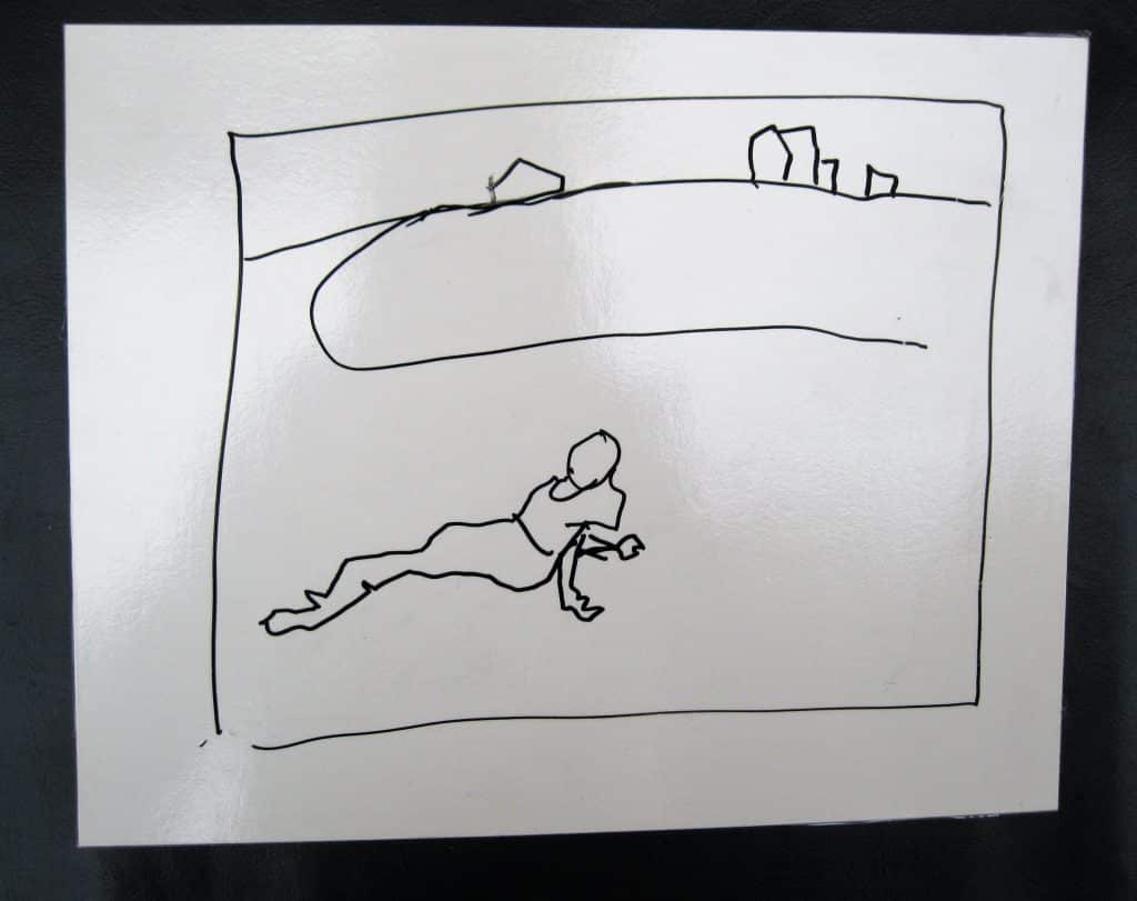
- Give a brief description and definition of a picture plane. “This lesson is about different ways the picture plane can be designed to show three dimensional space in a painting or photograph.”
- Lay out the simplest example to start the lesson. “This painting is the work of Andrew Wyeth called Christina’s World. It has a foreground, middle ground, and a background.”
- “Fore means out front. We have a forehead. It is out front on our heads to protect our eyes from injury. In a work of art the foreground is that part of the idea that is closest to the viewer. It is shown as being the closest thing to you.”
- “So if you could walk into this painting where would you be? Wait for the answer. “On the grass next to the woman.”
- “The grass and the woman are in the foreground. Next is the rest of the grass, some dark and some light in color which are in the middle ground, and last are the buildings and sky which are in the background.”
- Hold the reproduction in one hand and place your outstretched arm under the painting.
- “Watch closely to what happens to my arm as I named the parts of the picture plane.” Wait for the answer. “Yes, my arm goes higher and higher up as I move from one part of the picture plane to the next.”
- Make a diagram of the painting, as in the photo shown. Rename each part of the picture plane as you draw it. Label the parts.
- “This is a photograph of a building designed by the Chinese architect I.M. Pei that was built in Colorado. Like the painting, this photo too has a foreground, middle ground, and a background. Again I will use my arm to follow the parts of the picture plane.”
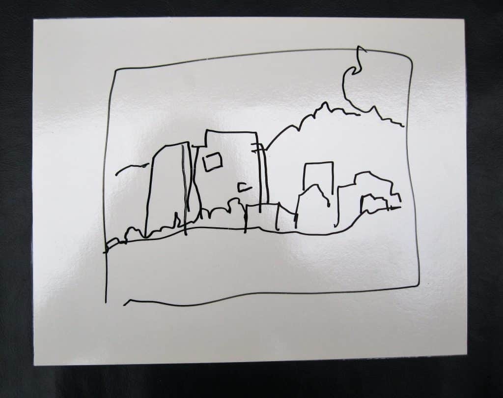
- Move your arm up the picture plane.
- “There is something extra in this picture plane that was not in the first example. See if you can find it.” Wait for an answer. “Yes, in the upper right hand corner there is a big branch which is a part of a pine tree that is not in the photograph. Nevertheless, it is part of the foreground. The limb is so close to us that you can see the needles.”
- Make the diagram as shown. Rename each part of the picture plane as you draw it. Label the parts. Use two foreground arrows.
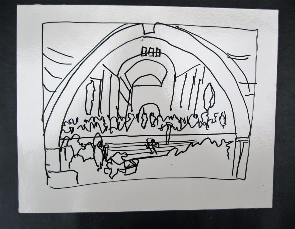
- “This is a painting done by Raphael called The School of Athens. The picture plane for the painting was an entire wall of a library where Pope Julius worked, way back in the 16th century in Italy.”
- “The foreground starts at the bottom of the painting as usual. All the people pictured across the bottom of the picture plane represent the leaders in the arts and sciences of that time or from an even earlier time. Some are realistic portraits.”
- “On the bottom right-hand side of the painting there is a column that starts at the bottom and moves up the picture plane to the top then down to the other side. It stops because there is a real door in the wall.”
- “The column is in the foreground. The painted areas around the top of the arch are also part of the foreground. The second row of people is in the middle ground. The two philosophers in the center are Plato and Aristotle. The two giant sculptures in niches above the second row of people are also in the middle ground.”
- “Everything behind them and above them is part of the background.”
- “The part of the background that is farthest away is the sky which appears behind the two center figures in the middle ground and is seen through three openings in the architecture.”
- Make a simple diagram – as in the photo shown – as you review the parts of the painting’s picture plane. “The foreground of the painting forms an interesting rectangle of seated and standing figures across the bottom of the picture plane. The column starts at the bottom and continues the foreground up to the top of the picture plane and back down forming a frame for the middle ground and background. The middle ground is another rectangle of people. The enormous sculptures in the niches above the people face forward just like the two center figures. The arched ceilings in the background repeat the main arch in the foreground.”
- Move your arm up the picture plane.
- Label parts of the picture plane. Use two to five foreground labels.
- Restore the labels to their container and place the shelf work in the environment.
Extension:
- Prepare an activity for the environment. It will not need a lesson. How to use the arrows will be part of the presentation. Choose postcards or other images for the activity. The activity will consist of postcards in a container and the arrows you used in your lesson on a tray. If possible, have the work ready and put it in place as part of your presentation.
Resources:
- I suggest the following book. Borrow it from the library or buy it.
- Cumming, Robert. Annotated Art: The world’s greatest paintings explored and explained. New York: Dorling Kindersley, 1995. P. 32 School of Athens is annotated for you.
- This lesson uses images which are part of a collection available from Nasco Arts & Crafts https://www.enasco.com/product/9723580A or 1.800.558.9595. It is a collection of 25 reproductions. I used three from the collection for the lesson. There are several reproductions that can be used for the environment Choose the 6 you like the best.
- My Choices would be: Matisse, Goldfish; Degas, Ballet School; Cézanne, Apples and Oranges; Renoir, Luncheon of the Boating Party; Vermeer, Woman with a Pearl Necklace; and Vigee-Lebrun, Portrait of a Lady.
- Images for Georgie’s original children’s lesson: National Gallery of Art – Website https://images.nga.gov
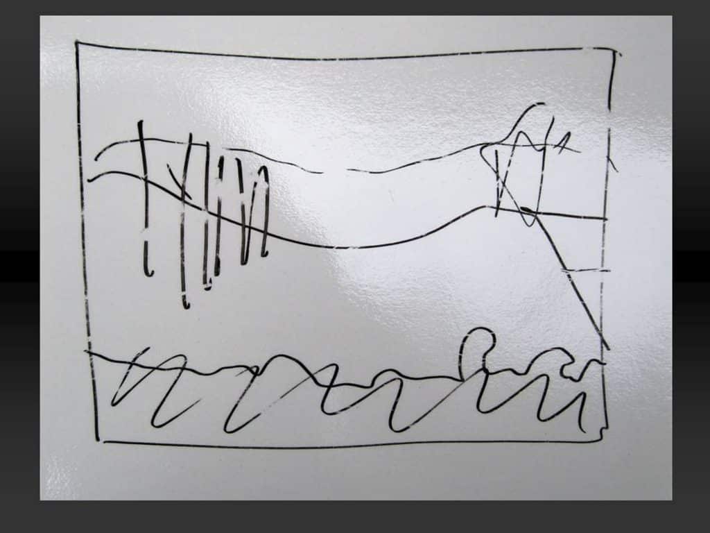
- The Cornell Farm, by Edward Hicks
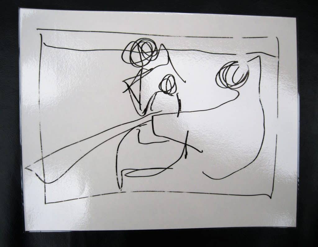
- The Boating Party, by Mary Cassatt
- Also see photos here of my diagrams for the original lesson.
Introduction:
The word space appears in two places in the Art Chart. The words are the same but each represents a different aspect (a way in which something can be viewed by the mind) of space. Space is an element of art and is considered again as an important Principle of Organization (Design). The word “Space” as an “Element” of art refers to how much and what kind of space an artwork occupies. Painting, drawing, printmaking, and photography are flat, two-dimensional art forms. They have only one side. Turn them over and there is nothing to see. Sculpture, pottery, installations, performance art, and architecture are three-dimensional, having many sides and views. The word “Space” as a “Principle of Organization” of art refers to how the illusion of three-dimensional space is created on a two-dimensional plane using only the five “Elements” of art. Artists have continuously and creatively manipulated the elements to create the “feeling” of space and to create emotional reactions as well. Over time their genius has broken barriers and presented us, their viewers, with many delightful hours of contemplation. The three-dimensional artists manipulate “real” space with the same genius. Moving physically around and/or through a three-dimensional art form stimulates our visual and mental growth with a sense of wonder. The Positive and Negative Shapes lesson starts the study of space (See: Sensorial). Figure Shapes and Ground Shapes, Overlapping, the Picture Plane and its parts are above this page. Advance lessons will follow in later Understanding Art sections of the MAM Curriculum.
Introduction:
This lesson was designed to sensorially present two and three dimensionality, using simple words to explain the basic difference between the two.- Prerequisite: Experience making two and three dimensional art
- Direct Aim: To explain the difference between two and three dimensional art
- Indirect Aim: Preparation for elementary geometry lessons
- Point of interest: Does your artwork have one side or many sides?
Materials:
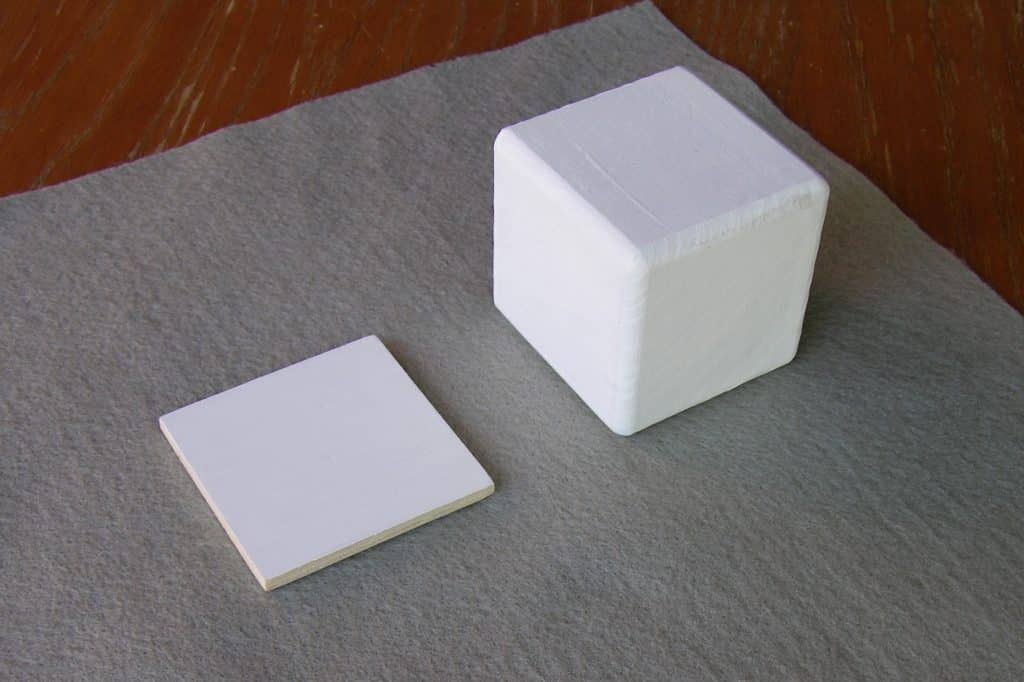
- A wooden cube (cardboard box)
- A wooden square (cardboard square)
- Note: The size of the square matches the sides of the cube.
- Use cardboard if necessary, and then make them out of wood later.
Preparation:
- Paint the top surface of the square white, or just seal the surface.
- Paint the cube white, or just seal the surface.
- Gather an example of every art making activity that has been in the environment. Include the basic skills and metal inset work. Include any building block materials present in the environment.
Presentation: 5
- Introduce the lesson by name. “Art takes up space. It uses up space just like you and I do.”
- “Some art has only one side like this square. If I turn the square over, the white can not be seen. This drawing has only one side. When I turn the drawing over you can no longer see it.”
- “Some art has many sides. This is a straw tetrahedron. It has many sides. I can turn it over and I can still see it. Our building blocks can be used to make an idea which has many sides. I have collected some of the work we have made this year. Let’s decide what kind of space each uses. Does it have one side or many sides?”
- Discuss each one.
Extensions:
- Photograph building block sculptures. The building block work can not be taken home. Many artists working today make art that is created in a special space. It is termed “Site Specific.” It is photographed because after a while it will be taken apart just like block constructions made by your children. Mount the prints, make museum tags for them and have an exhibition. Introduce this idea to the children so they can enjoy the process. Research artists working with light to make an idea. James Turrell and Dan Flavin have both made site specific light works. Tableaus are usually site specific.
- Create a matching activity of three dimensional objects that you have photographed. The object will have many sides and the photo will have one.
Introduction:
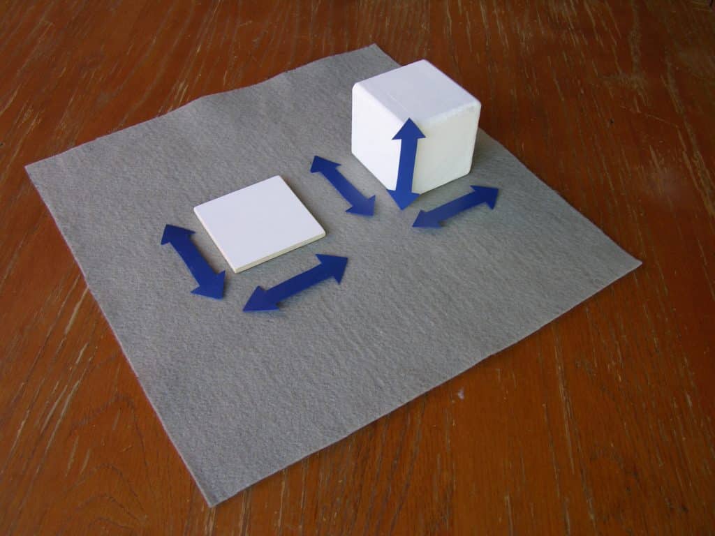
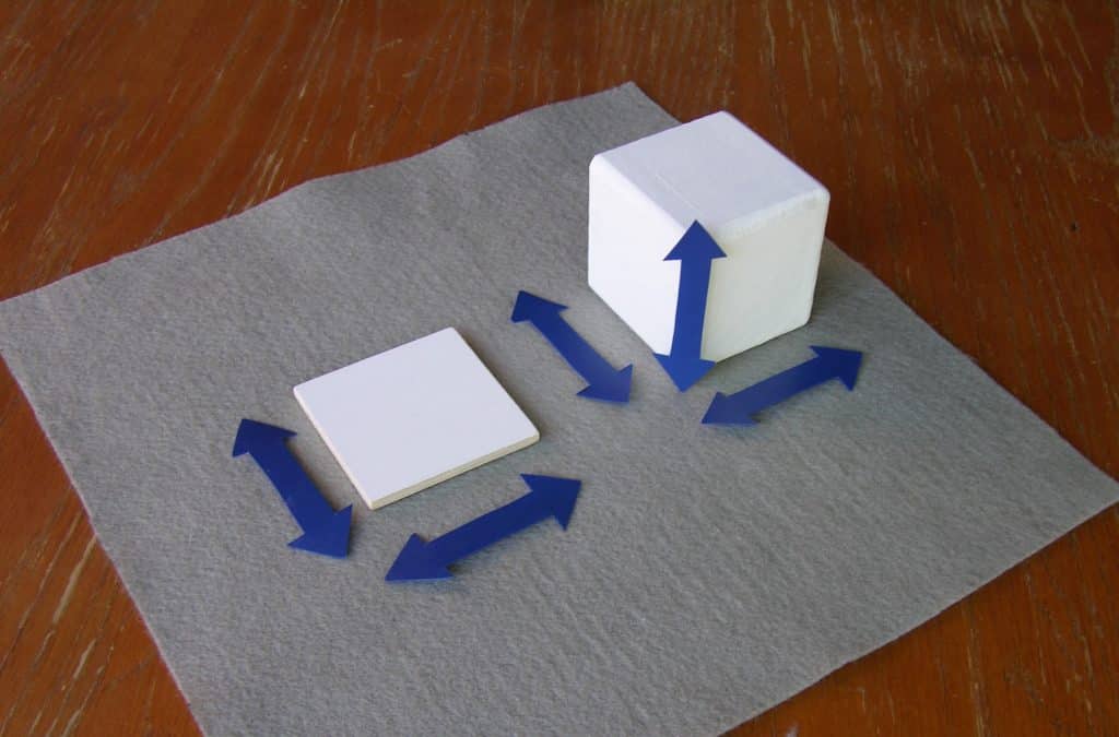
An art reproduction of a painting, drawing, or print always reports the size of the original artwork before framing by starting with its height. Height is measured from the bottom of the artwork to its top. Next is its width. Width is measured from the left side of the artwork to its right side. An art reproduction of a sculpture, installation, or tableau reports first the height, then width, in the same way as a painting. The added dimension of depth is last. Depth is measured from the front to the back of the work. The word dimension holds the key to its explanation. A dimension is a direction you can measure, such as height, width, or depth. This is an art lesson. Integrate it with the math lessons for geometry after the concept of point, line, surface (math) or plane (art), and solid have been presented. Most reproductions give the measurements of a work of art in the United States customary measuring terms of inches, feet, and yards, followed by the metric terms of centimeters and meters. Note: I taught this lesson using a cube and a square. Review the lesson. It can be given using a rectangular prism and a rectangle if you think it would be easier for the children to understand. The square and cube would then be an extension.- Prerequisite: Characteristics of a cube and square
- Direct Aim: To recognize two or three dimensional art forms
- Indirect Aim: To understand the concept of the Picture Plane
- Point of interest: “Could you make a list of two-dimensional and three-dimensional objects present in our environment?”
Materials:
- A wooden cube (cardboard)
- A wooden square (cardboard)
- Note: The size of the square matches the sides of the cube.
- A set of 5 plastic arrows pointed at each end.
Preparation: 6-12 (see photos)
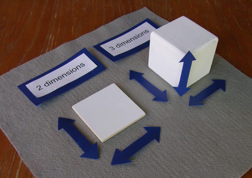
- Choose the wooden square and cube
- Paint the top surface of the square white and the whole cube white.
- Make 5 arrows that are ½” wide and pointed at each end. Make them as long as the sides of the cube. (See: Resources below)
- Make labels:
- Title Label: Art Takes up Space (Large)
- Label: Two Dimensional Shape (Medium)
- Labels: length, width (Small)
- Label: Three Dimensional Shape (Medium)
- Labels: height, width, depth (Small)
Presentation: (6-12)
- “All art takes up space. It can take up two dimensional space because it has two dimensions, or it can take up three dimensional space because it has three dimensions.”
- “The key that unlocks this lesson is the meaning of the word dimension. A dimension is a direction you can measure.”
- “Any artwork that can only be measured in two directions is called two dimensional. It has length and width.”
- “The square has two directions.” Run your pointer finger up both sides of square from bottom to top several times. “This direction moves from the bottom of the shape to its top. It is the dimension of length. Both sides are going in the same direction, so only one side needs to be measured.” Place the first arrow next to the square on the left hand side.
- Run your pointer fingers from side to side several times on both sides of the square. “The second direction moves from side to side. It is the dimension of width. Both sides are going in the same direction so only one needs to be measured.” Place the second arrow next to the bottom of the square.
- “Any artwork that can be measured in three directions is called three dimensional. It has height, width, and depth.”
- “The cube has three directions.” Using your pointer finger, trace the height of the cube from the bottom to the top. “This edge is its height.” Open your left hand palm up. Place your other hand on top. Start with your hands on the table (rug) and lift the top one up for emphasis. “Height describes how high the shape rises from its bottom to its top.” Place the arrow on the edge.
- With your pointer finger, trace the bottom edge of the cube from side to side. “This edge is its width.” Place your hands together with your thumbs on the top and the little fingers at the bottom. Open your hands. ”The width describes how big it is from one side to the other.” Place the arrow on the bottom edge.
- With your pointer finger trace the bottom edge from the front of the cube to the back. “This edge is its depth.” Place your hands on the top of each other with the palm of one hand on top of the back of the other. Point your thumbs up so that your little fingers will be at the bottom pointing in two directions. Move your top hand away from the bottom hand. “The depth describes amount of space there is from the front of the cube to its back.” Place the arrow on the bottom going from front to back.
- “A cube is a very special shape. It has six sides and they are all squares. The height, width, and depth go in three different directions but they all are the same size. The same is true of the square. The sides go in two different directions but both are the same size.”
- Review the hand motions for each dimension. Have fun teaching them to your students. Make up a game.
Extensions:
- Create a second activity to be done independently. Use a rectangle and a rectangular prism. There would be two different sized arrows for the rectangle and three different sized arrows for the prism.
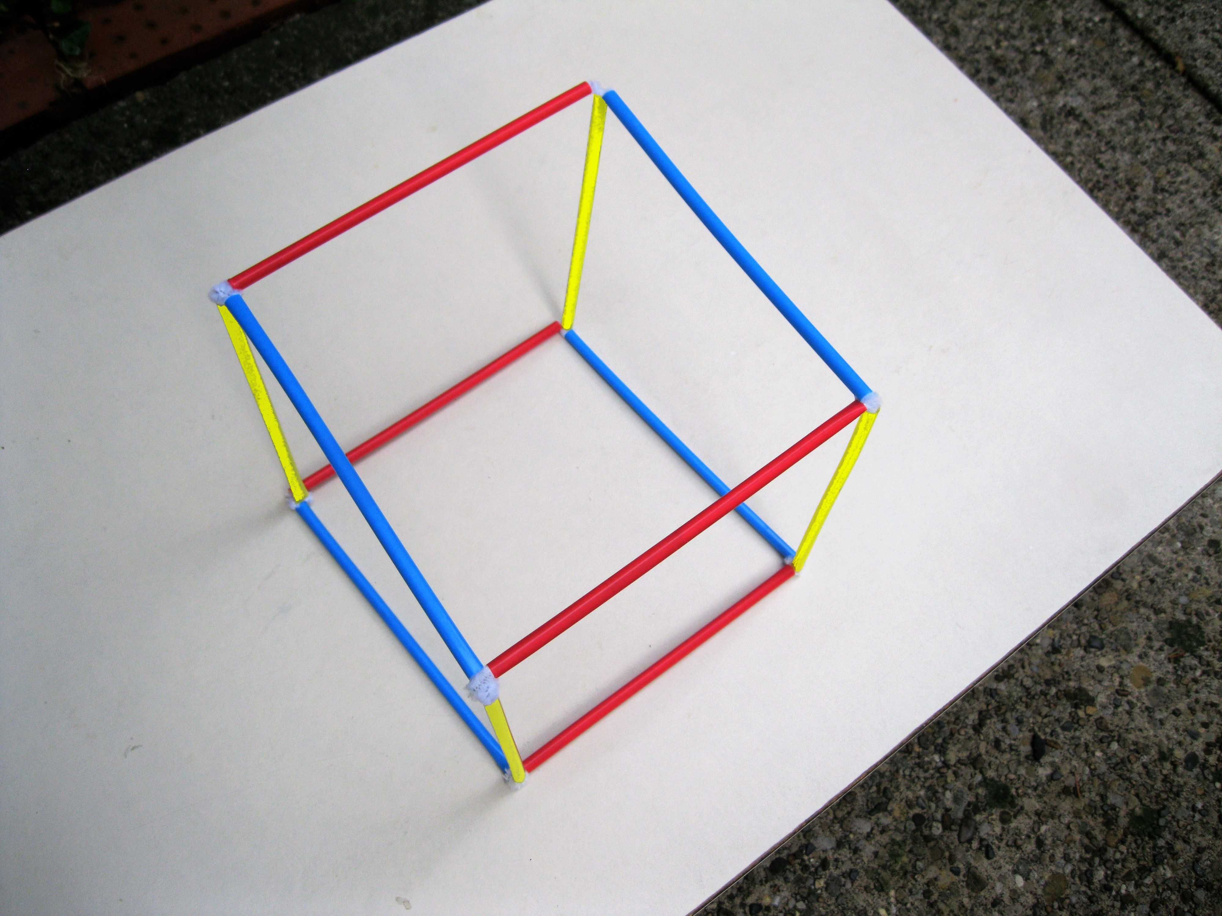 Make a cube out of colored straws. (see photos)
- Materials: 4 yellow straws, 4 red straws, 4 blue straws, and 24 long white pipe cleaners
- Preparation: The yellow straws will represent the height of the cube, the red will represent its width, and the blue its depth. The pipe cleaners will connect the straws to form a cube.
- Start the cube by making two squares, each having 2 blue and 2 red straws.
- For each square, lay the straws on the table so that the 2 blue ones form the vertical sides and the 2 red ones form the horizontal top and bottom.
- Fold 8 pipe cleaners (PC) in half. Insert the 2 ends of a PC into the top of the left-hand blue straw and leave the folded loop extended up.
- Insert one end of a folded PC into the loop at the top end of the blue straw, then put the 2 ends of the PC into the top red straw to form a corner.
- Add another folded PC into the other end of the red straw and leave the folded loop extended out.
- Link another folded PC to form a corner with the right-hand blue straw.
- Connect the next red and blue straw in the same way to finish the square.
- Push all connecting PCs into the straws.
- Make another identical square. You have the top and bottom of the cube.
- The yellow straws will connect the 2 squares to make the cube.
- At the top left corner of one square, lay a new PC diagonally under the corner connection.
- Pull the two ends of the new PC up to hook the corner, leaving the two ends sticking up.
- Push a yellow straw down onto the two free ends of the PC completely, forming a corner and one vertical edge of the cube.
- Repeat steps 1—3 at each corner of the square.
- To prepare the second square to become the top of the cube, hook a new PC sticking up at each corner, as in steps 1 & 2 above.
- Turn the square over so the pipe cleaner ends hang down.
- Insert the PC ends at each corner completely into the open ends of each vertical yellow straw.
- Make sure that the blue straws of the bottom square are above the blue straws of the top.
- Make sure all corners are snug.
- Start the cube by making two squares, each having 2 blue and 2 red straws.
- When looking at a reproduction, its size will always be described by two or three numbers. If it is three dimensional, the first number will the height, the second will be the width, and the third will be the depth. If it is two dimensional the first number will be the length from its bottom to its top and the second will be the width from one side to the other. Create an activity with reproductions of paintings and sculptures that are to be matched with separate labels that contain the numbers describing their size.
Resources:
- Office supply store, e.g., Staples:
- Blue Poly Report Cover to use for making the arrows to match the color of the geometric cabinet materials.
- A small cardboard cubical box
- A matching square of cardboard
- Michael’s: Wooden cubes (A matching square will need to be cut from a larger piece of matching wood).
